Philips
UI Design
Complete redesign of the global television category pages.
Services
I was asked to (re)design the UI of the television category pages of philips.com.
We did two sessions with the client where we aligned stakeholder wishes and investigated technical possibilities.
Objectives
The goal was to simplify the designs and stimulate the user experience. The extensive Philips style guides were applied to the designs and the designs had to be built with the Adobe CQ5 CMS.
Solutions
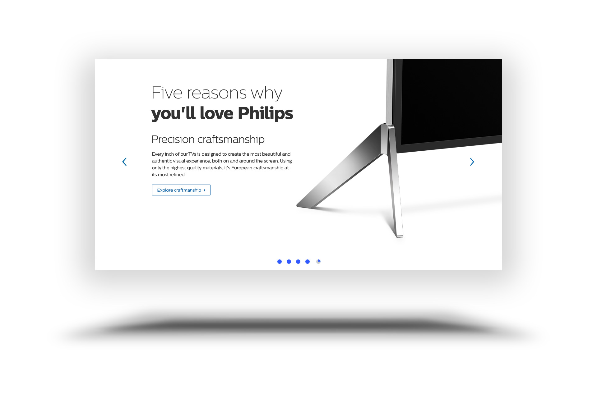
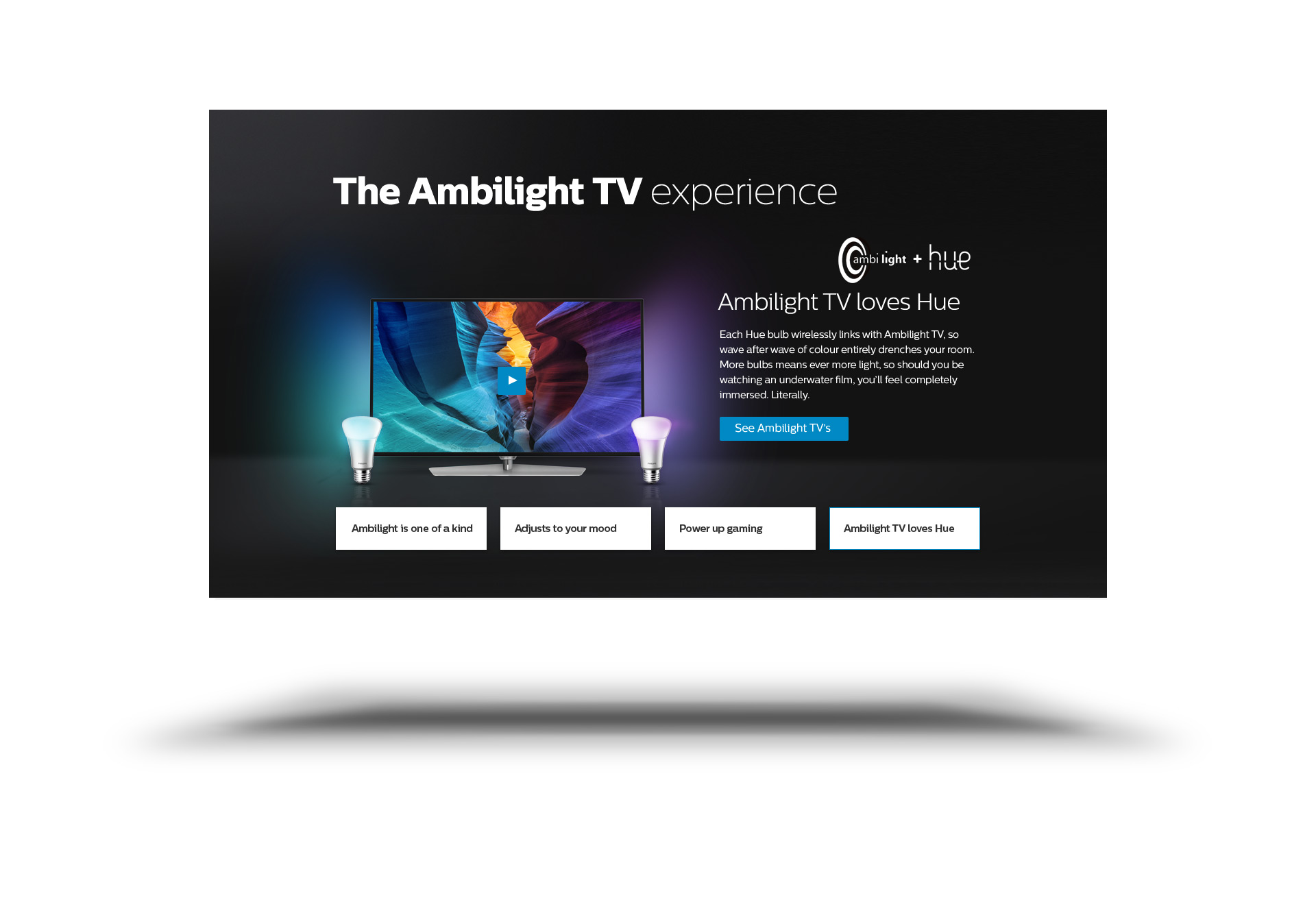
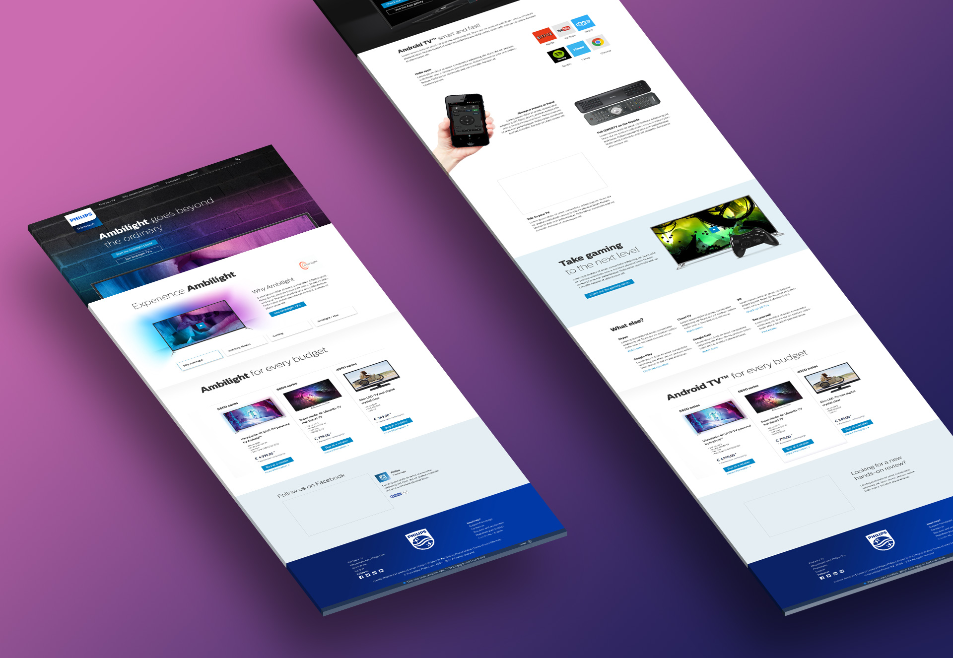
We proposed a stacking approach, where pages can be built op out of different reusable content blocks. And lead the customer thru a series of USP’s to reach a CTA.
Results
Although not all our proposed UX designs were possible within the online Philips environment (Adobe CMS), all the UI designs were immediately on brand. We delivered a complete redesign within 3 weeks total, that were aligned with stakeholders, frontend and backend and deployed shortly after.
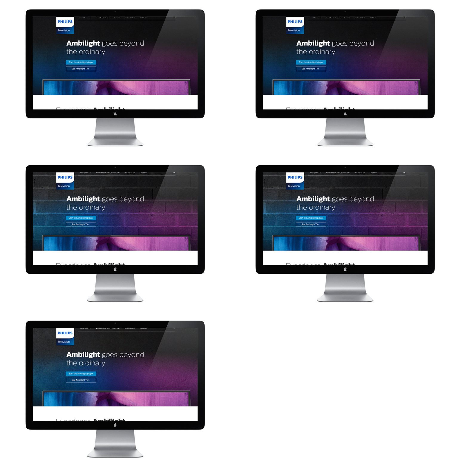
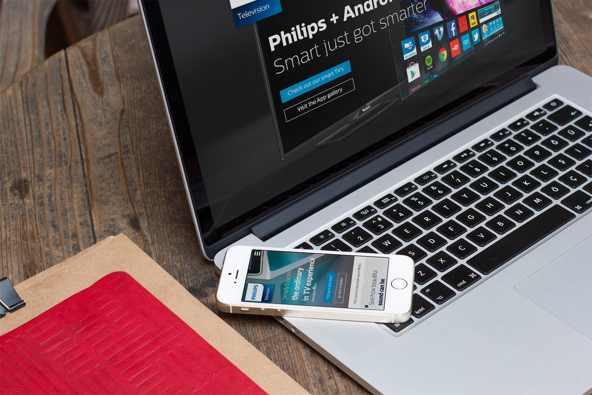
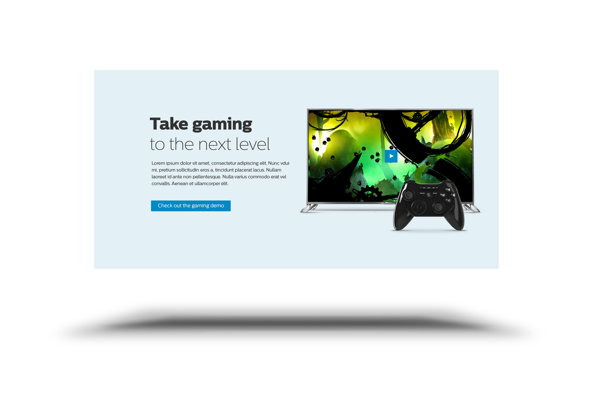
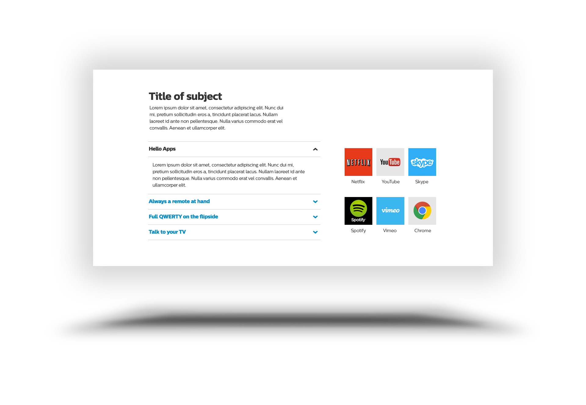
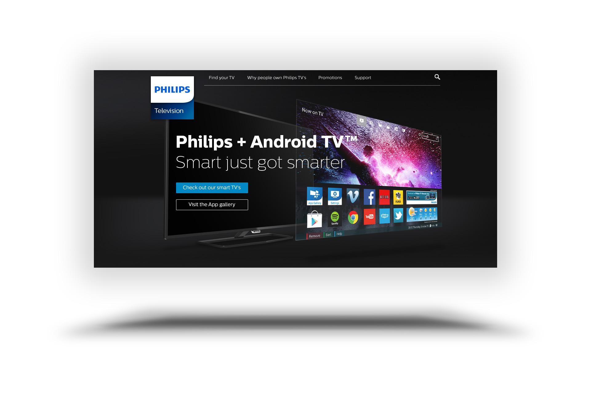
Stacks as building blocks for category pages.
Combining dark and light stacks and balancing out image stills and text stacks to create a balanced visual rhythm.

This project was commissioned by info.nl
Role:Lead UI
Lead Interaction design:
Joris Huijbregts (Info.nl)
Philips
creative director TPVision:
Robert Phillips
Digital Service Manager TV:
Yannick van den Hurk
online marketing manager TV a.i.:
Henriette Goor
Service Expert Online Studio:
Barry Aben
