adidas
UX & UI Design
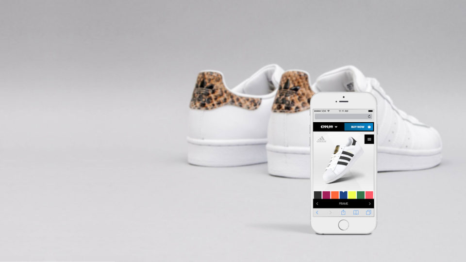
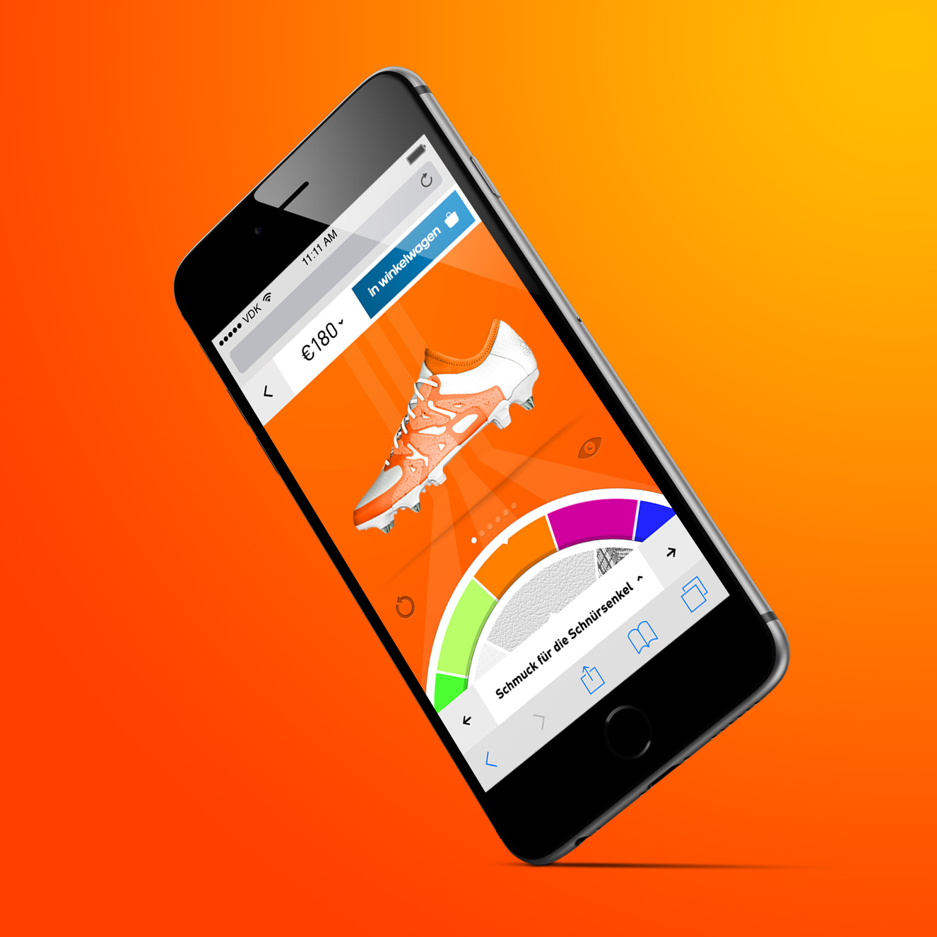
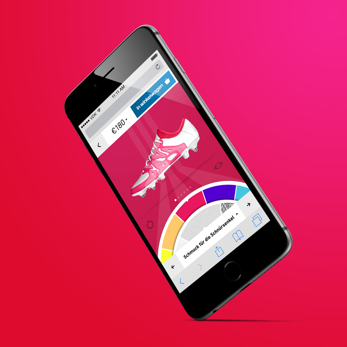
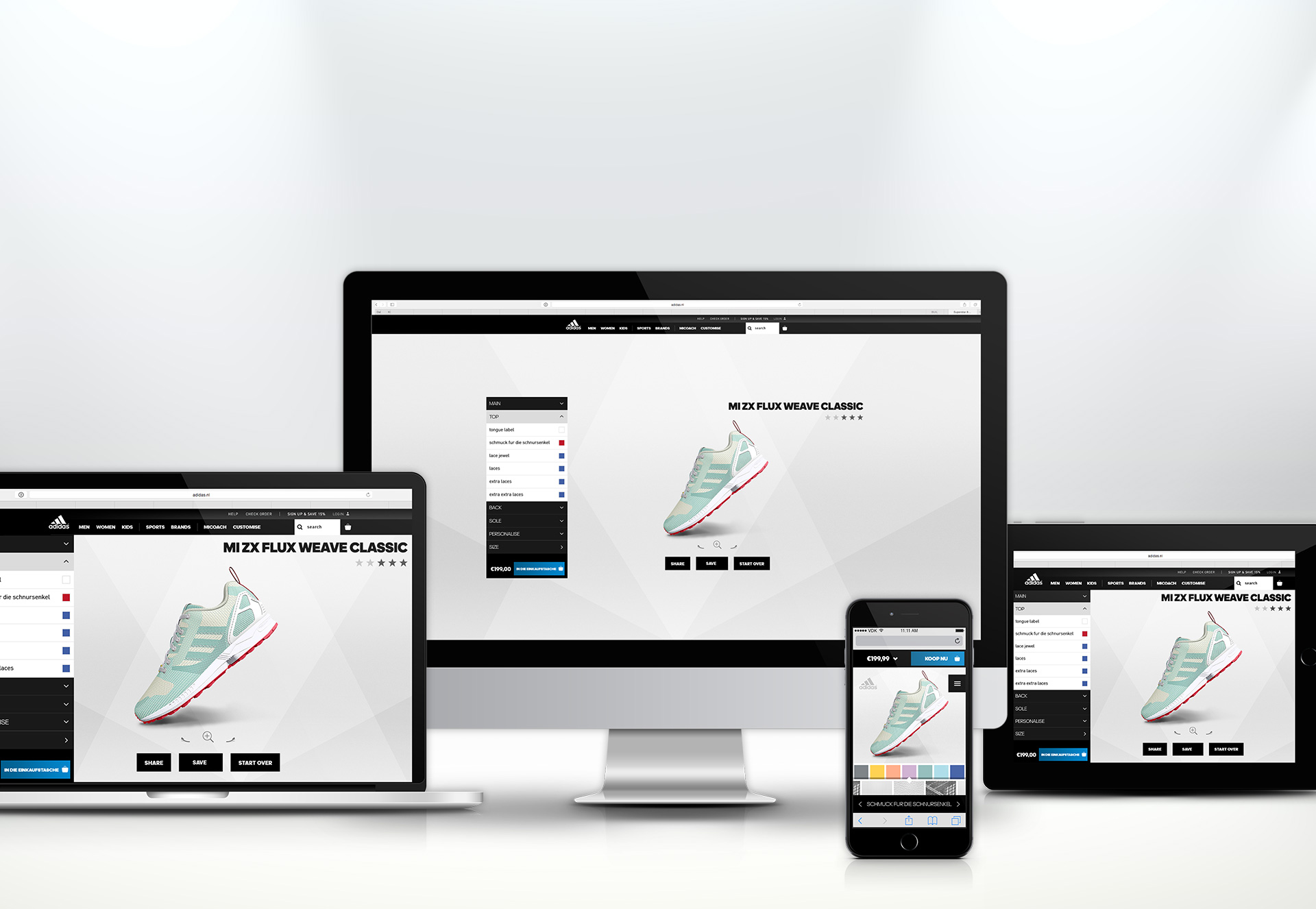
Redesign of the global online miadidas configurator.
Services
UX and UI designing the miadidas configurator.
Objectives
Redesign of adidas’ online configurator for mobile and desktop. Two main goals: simplify the primary user journey and make customising your shoe a fun experience.
Solutions
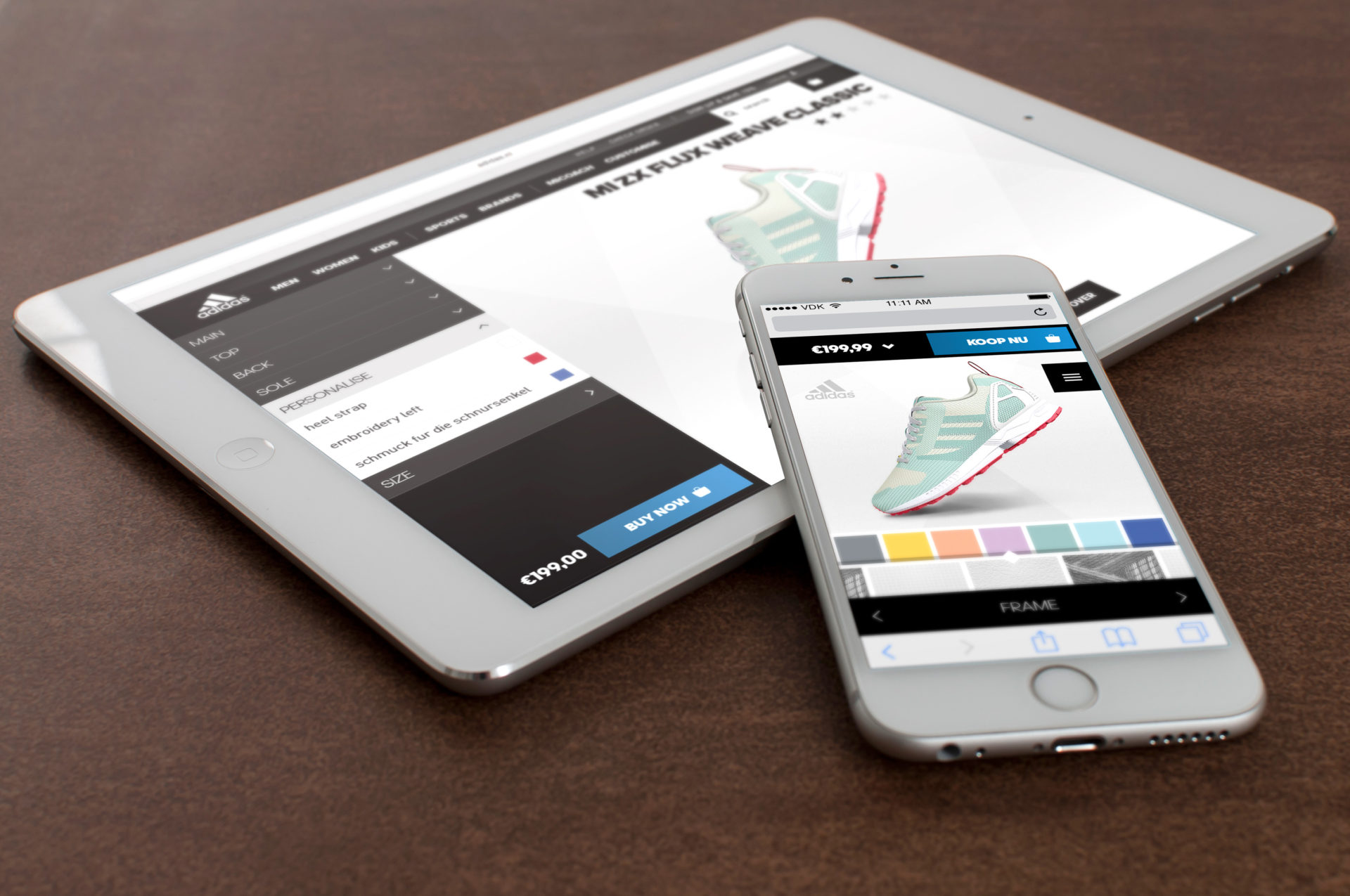
Miadidas configurator is designed to be adaptive. For mobile a completely different UX;we believe that apart from the different screen sizes, there are aberrant user patterns and user goals and thus behavior is completely different. Both experiences balance overview, hierarchy and fun to the given screen real estate.
Results
A completely redesign and rebuild configurator. Combined with a full exclusive program for retail experience in New York City Flagship Store on 5th Avenue, Tokyo and Shanghai. Session time has increased immensely. Leading to a growth of 40% year over year.
Sketching
Visualizing goals
- To quickly visualize our concepts and test them with an audience we sketched out our ideas on good ol’ paper.
- The best way when brainstorming usability solutions, is to visualise them quickly onto paper. See if it works, if you are curious, and want to see more, go digital.
UX Design
Proof of concept
After some quick validation of our ideas we translated the best ideas from paper to digital.
Wireframing templates and and setting up the online testing environment.
We created easy tasks for users and monitored how they responded on the designs. We adjusted the designs where needed and retested until it was clear.
UX meets UI
Exploring interaction
and interfaces
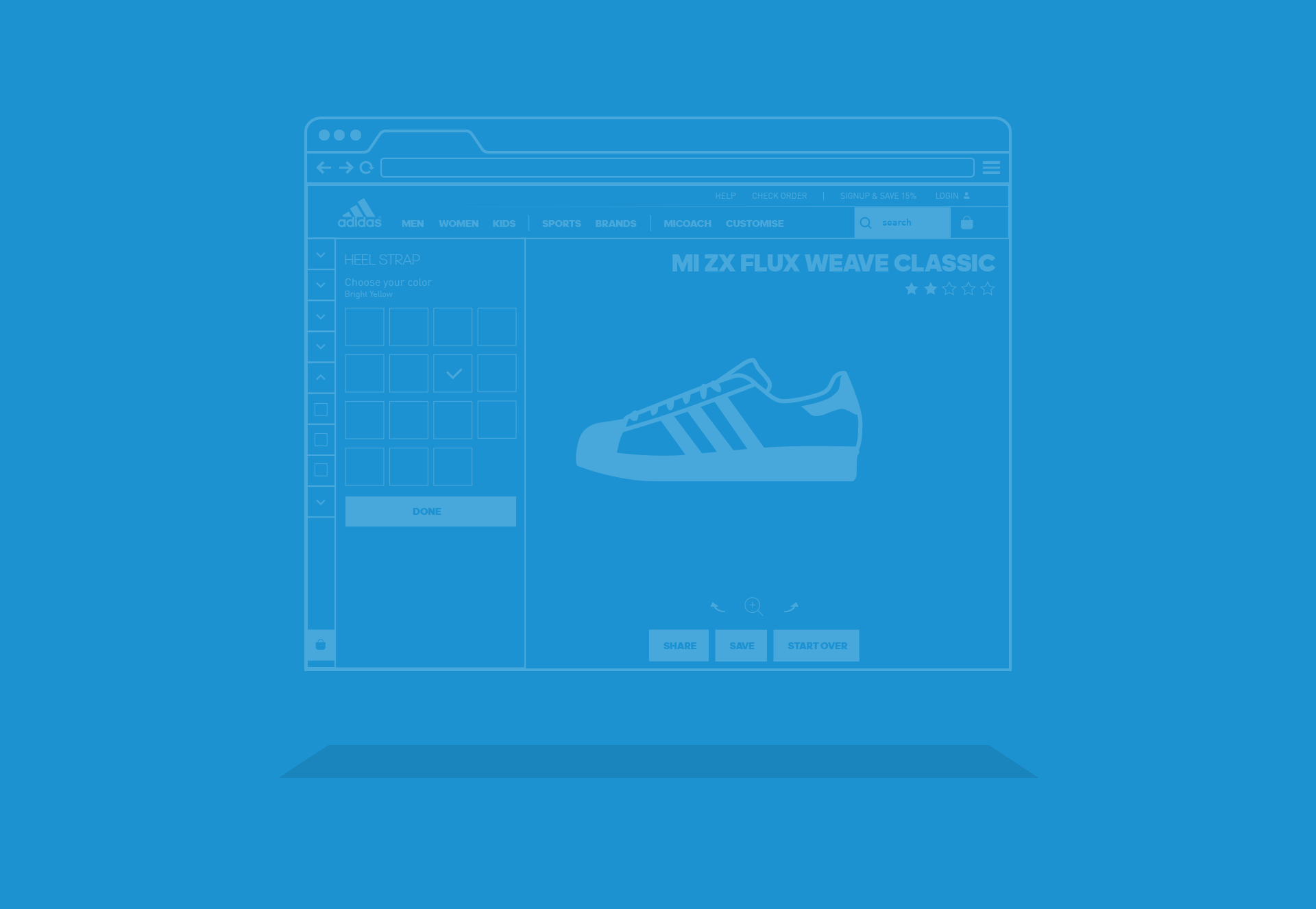
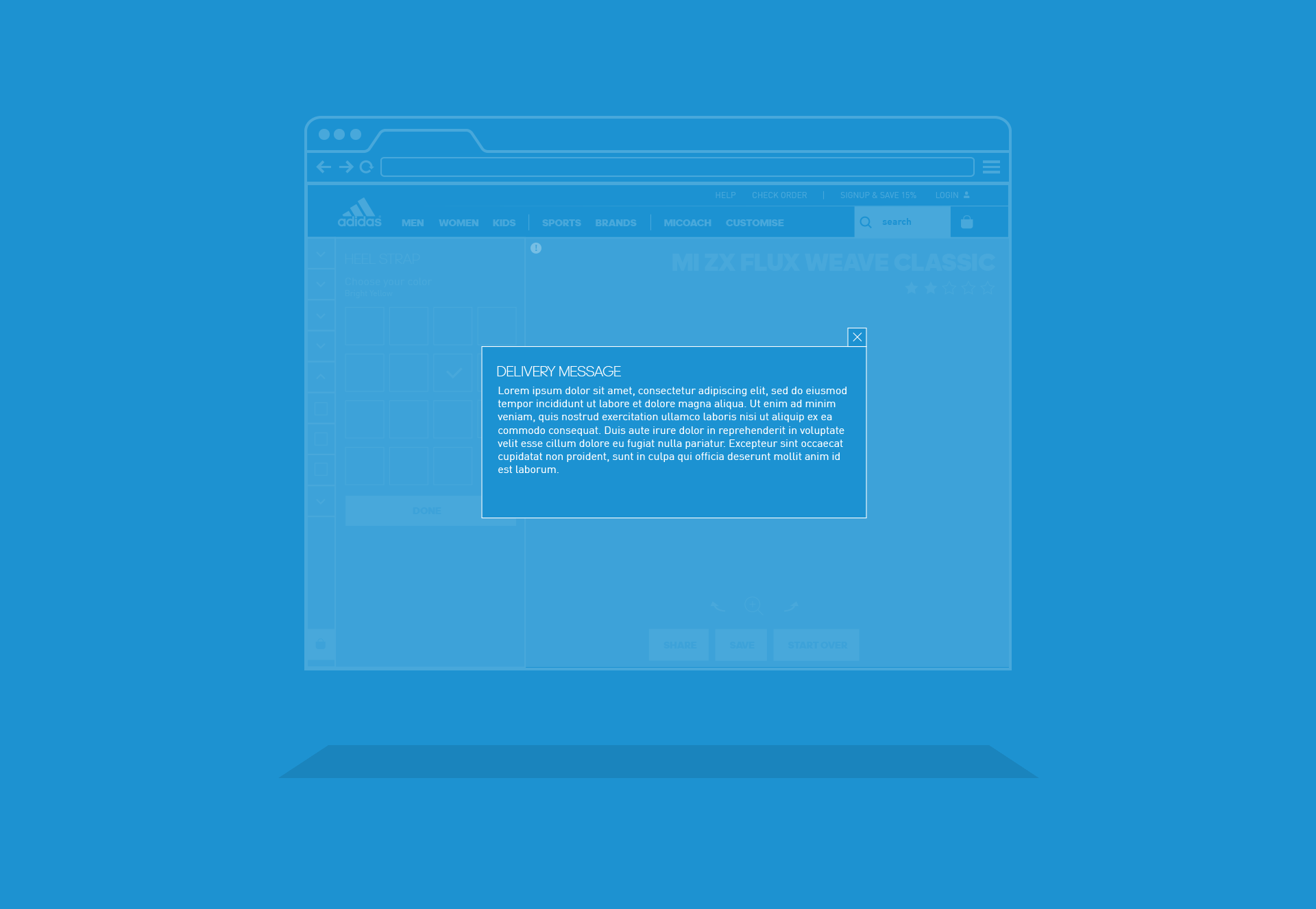
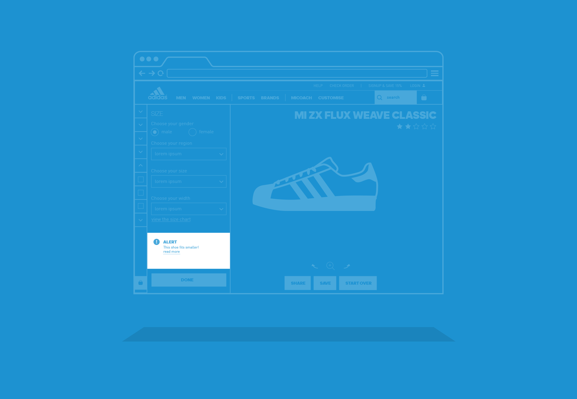
For desktop we had a less adventurous approach compared to mobile, the challenge
was more in creating ‘ease of use’ on both touch and non-touch platforms.
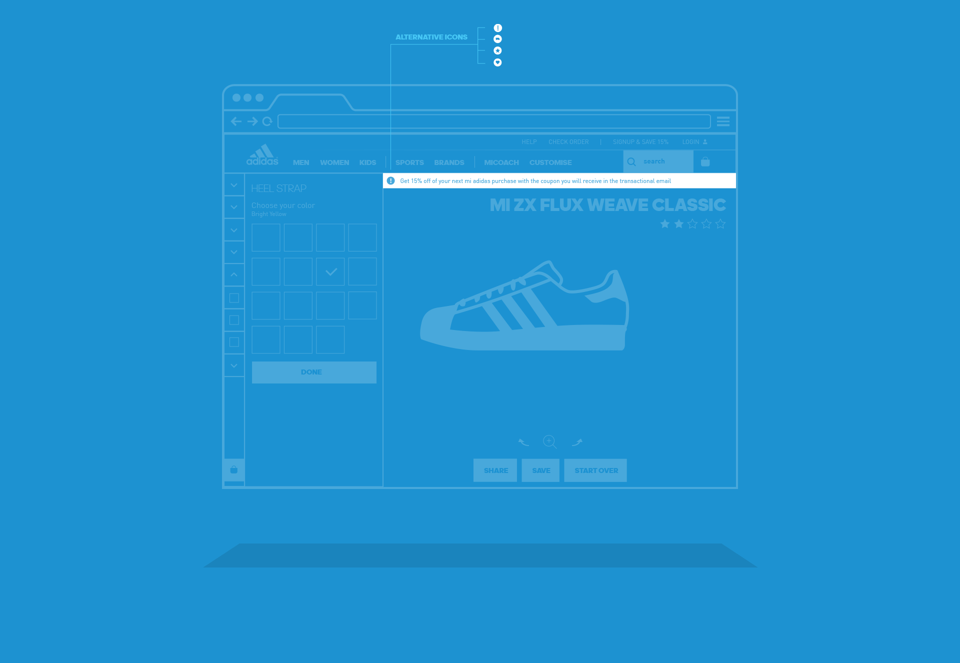
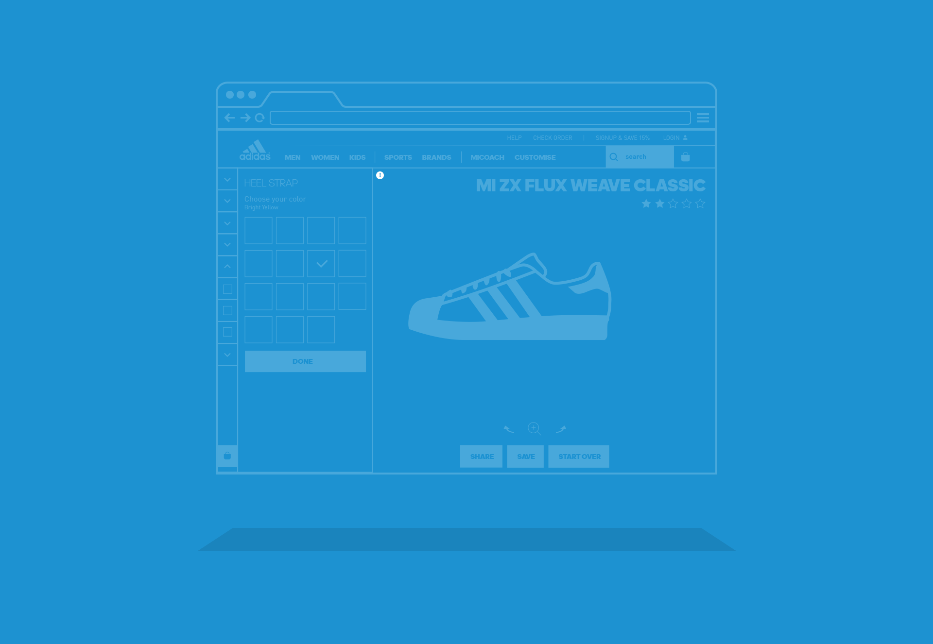
We did extensive research on the ‘save design’ and ‘share design’ ux.
In the old version there was a difference between saving and archiving.
Little users understood this. And so we simplified this process.
Animated concepts
Prototypes in After Effects
first low fidelity prototype for mobile
One of the ideas was to create a series of predefined color combinations
to help novice users to kickstart, to comply the goal of simplicity.
We came up with the idea of the spinner.
And wanted to see how and if it could work.
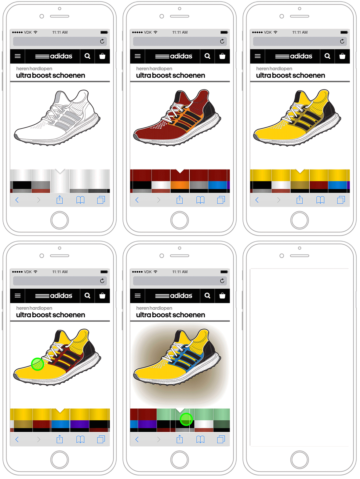
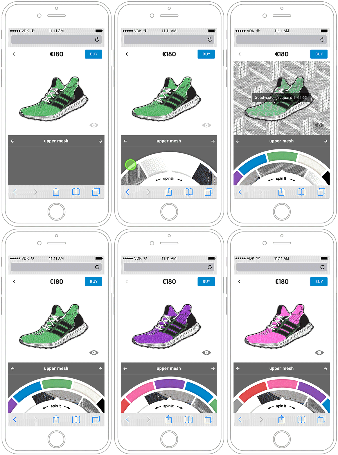
Second low fidelity prototype for mobile
The second concept demo I made was a more advanced version.
Where ‘the spinner’ as we called it, got a more prominent role.
We were happy with the way it looked and added the UI…
Adding fun in the mix
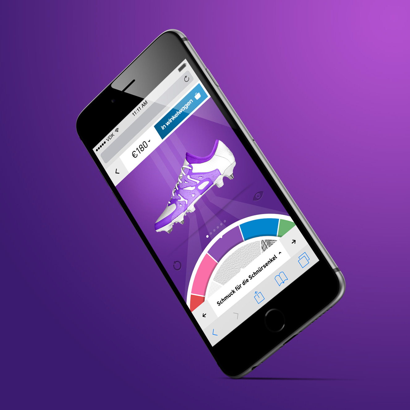
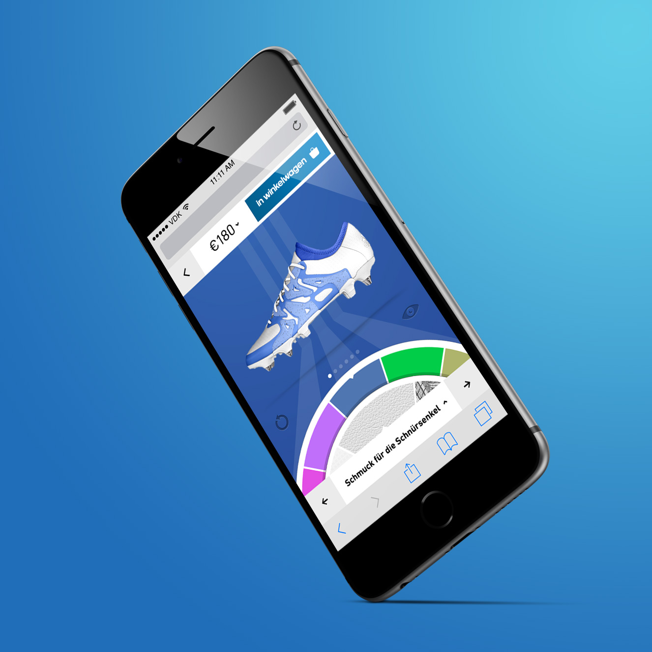
The Spinner
When designing a shoe, you will continiously browse thru colors and materials, until you feel it is the right match. We wanted to create an interaction that was both fun and easy to use. This is how ‘the spinner’ came to mind. We made multiple versions, like this 360 one. But it eventually did not make the cut. We chose a more conventional approach in a horizontal spinner.
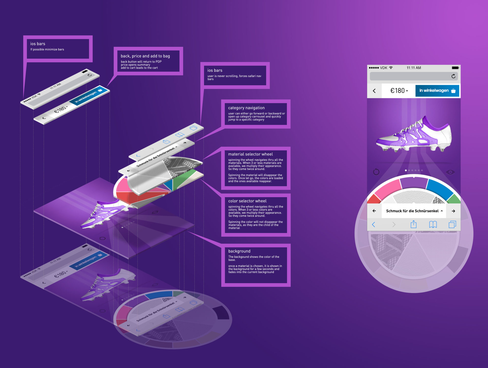
UX meets UI
Exploring interfaces
For desktop we explored the concept of having the background adjust to the base color of the shoe. And predefine a compliment set of colours for the typography. Where for mobile the background would shortly change to the color chosen on any item that was configured, for desktop the the color would only change to the color of the base. So changing the laces would not change the color of the background. This would mean that you have choose the most dominant configurable item per shoe. Which in some cases was nearly impossible. And we would have to create a large set of complimentary color schemes. In the end a grey background with multiplied images was chosen.
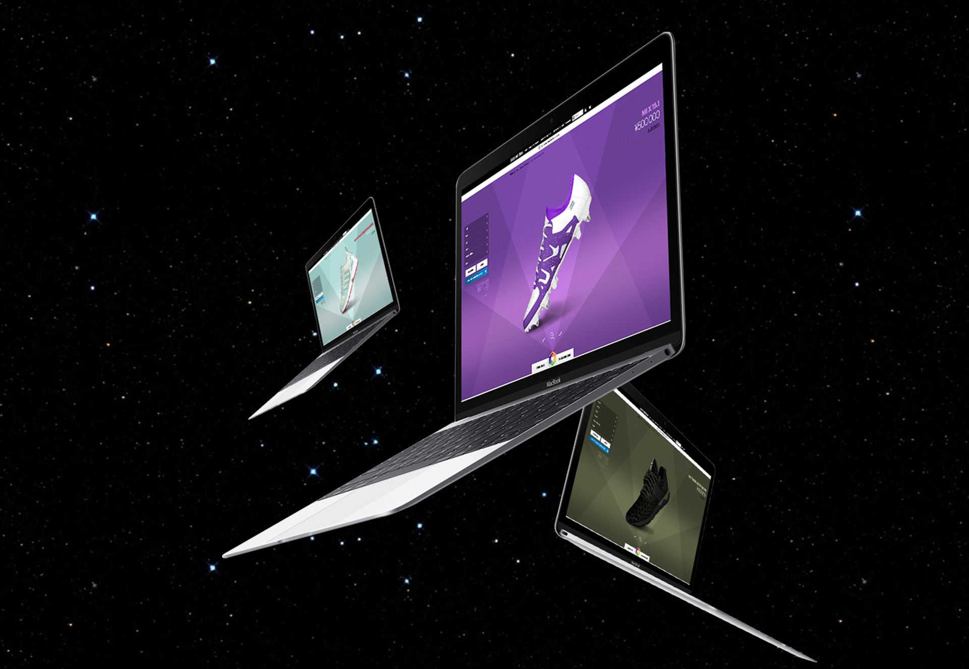
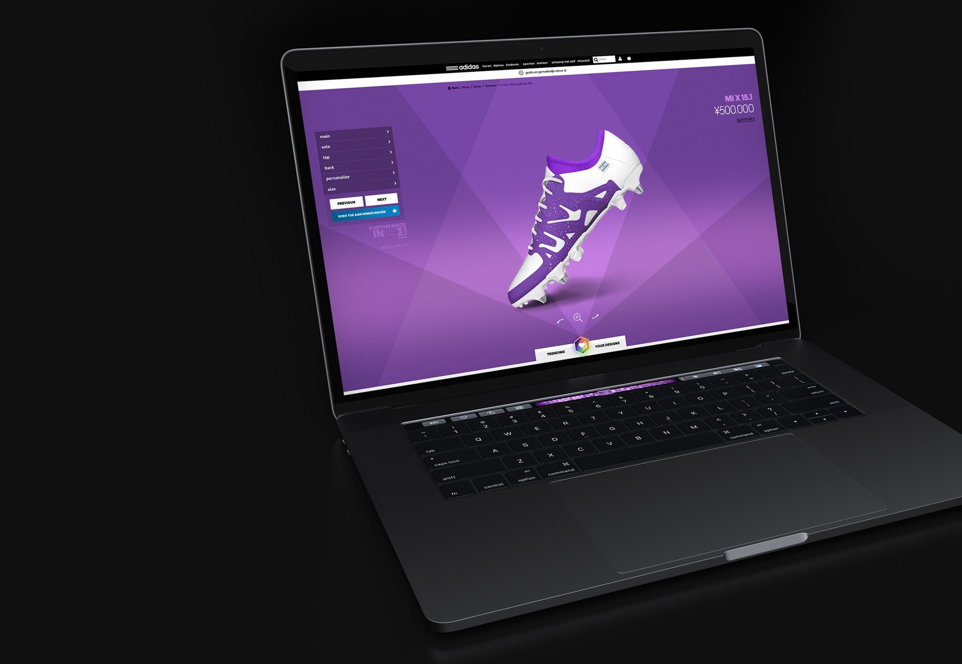
MIADIDAS
2017 ECO SYSTEM
This is it. The final design setup of the complete 2017 miadidas configurator.
Thank you for your attention. Hope you liked it.

This project was commissioned by Adidas
Role: UX/UI Designer
Adidas
UX/UI Senior Director
Vinnie Hendriks
Senior Director Consumer Experience
Raffael Sarracini
Product Owner miadidas
Fotios Paliogiorgos
