Feadship
UX & UI Design
UX/UI design the worlds most exclusive yacht builders fleet app.
Services
UX and UI design of Feadships Fleet App.
Objectives
Turn the yearly Feadship Spotters Guide into a mobile app; the Feadship Fleet app.
Solutions
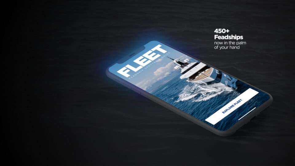
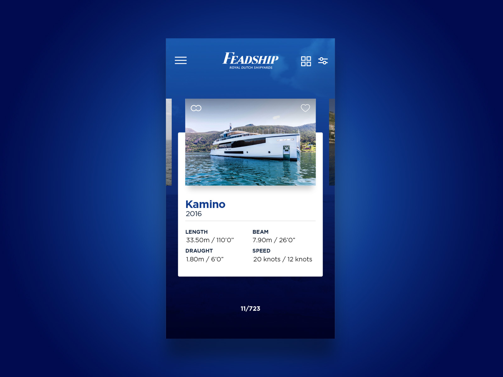
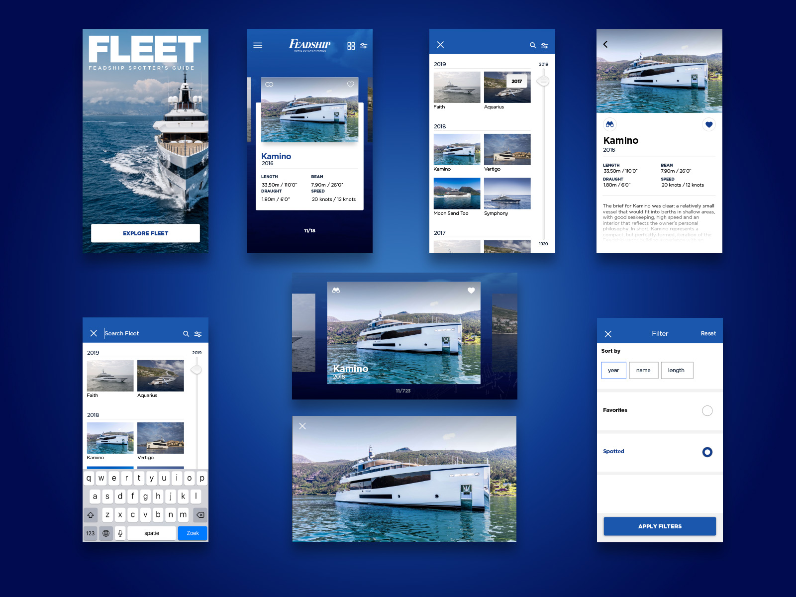
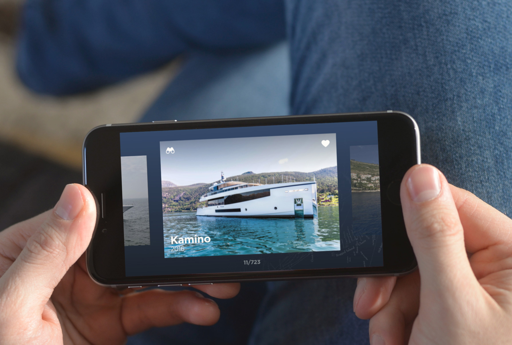
A IOS and Android app, with all 450+ Feadships in the palm of your hand. Adding motion and multiple viewing modes to search, store and explore your favorite Feadships. Keep track of the ones you love, and the ones you’ve spotted.
Results
Feadship Fleet Spotter’s Guide offers the ultimate listing of all Feadships built and is updated regularly with our spectacular new launches. Browse the favourite Feadships and keep track of all those you spot in the wild.
Mapping out the playing field
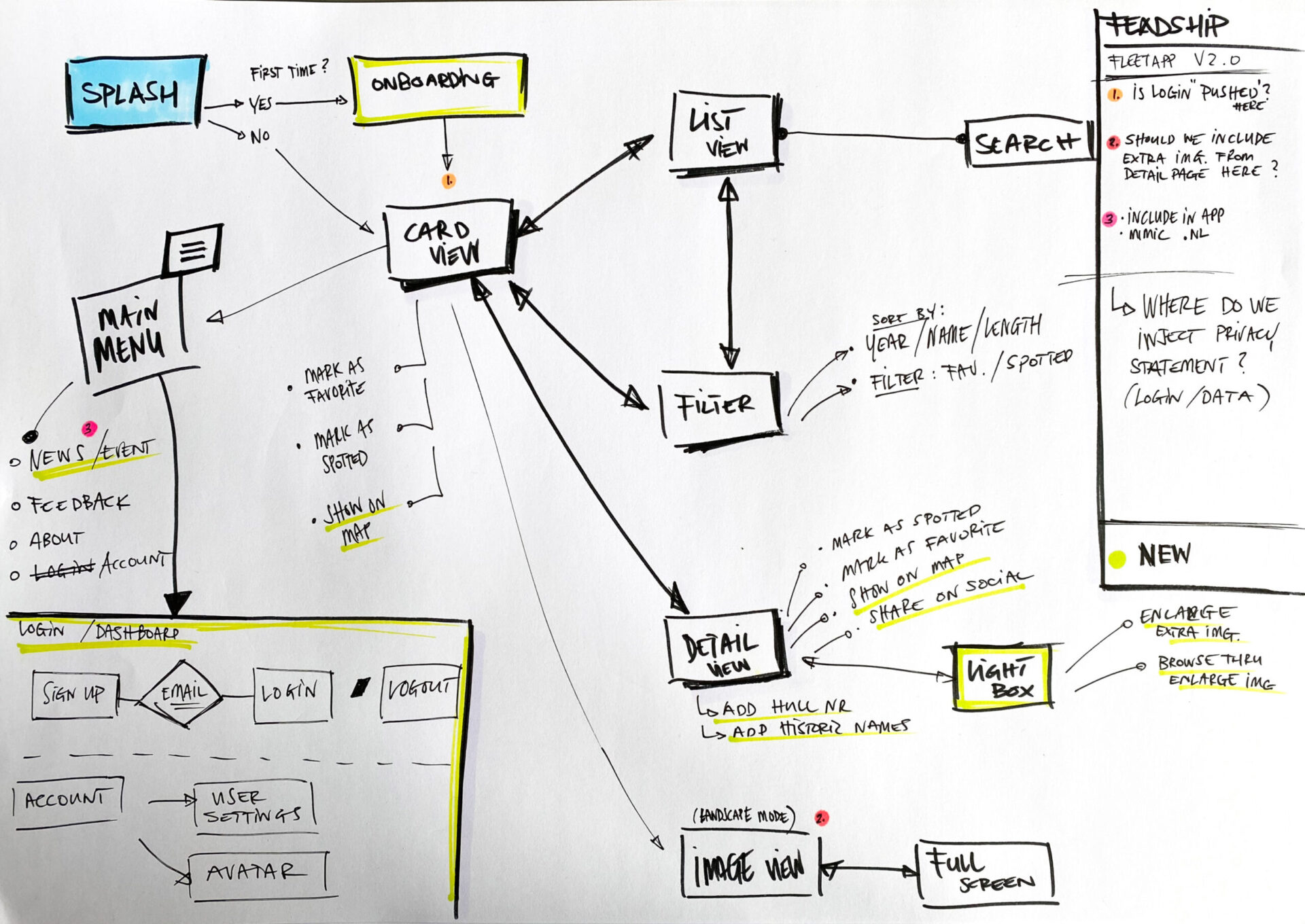
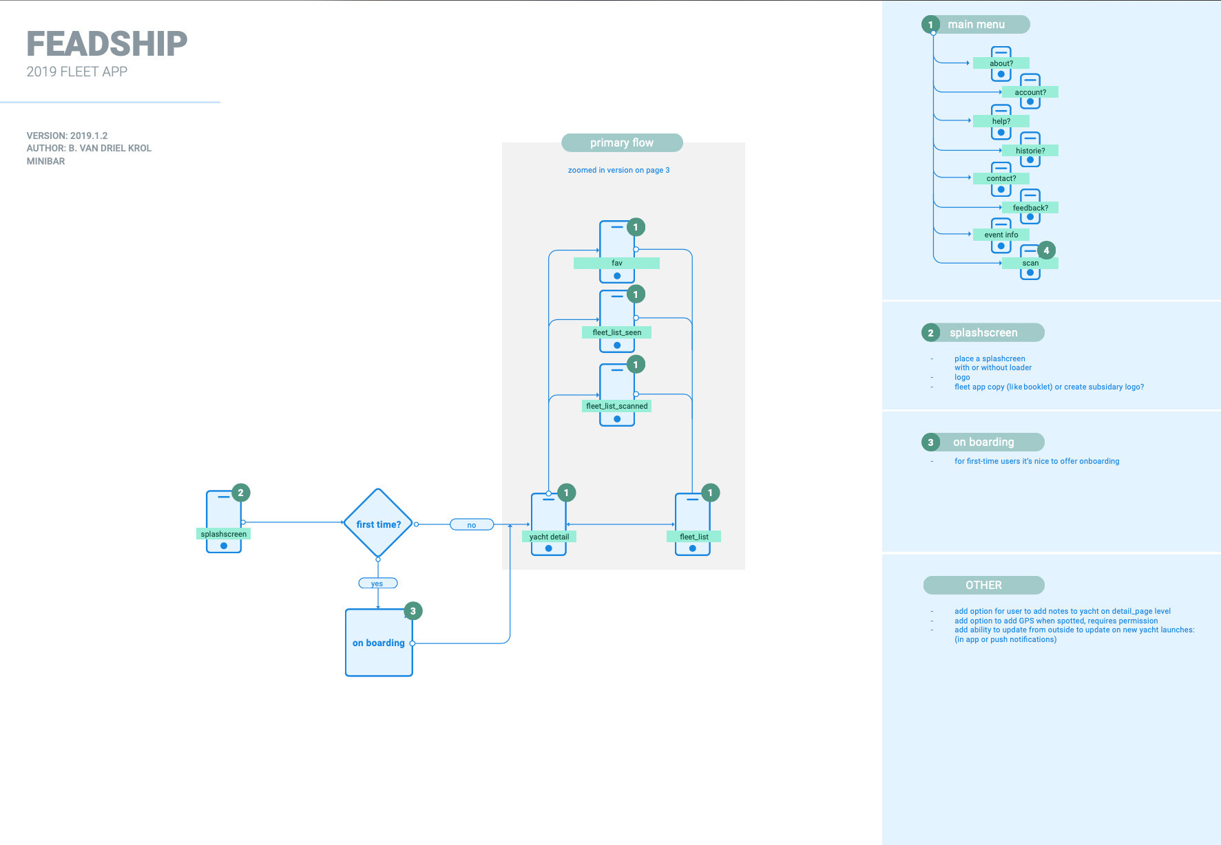
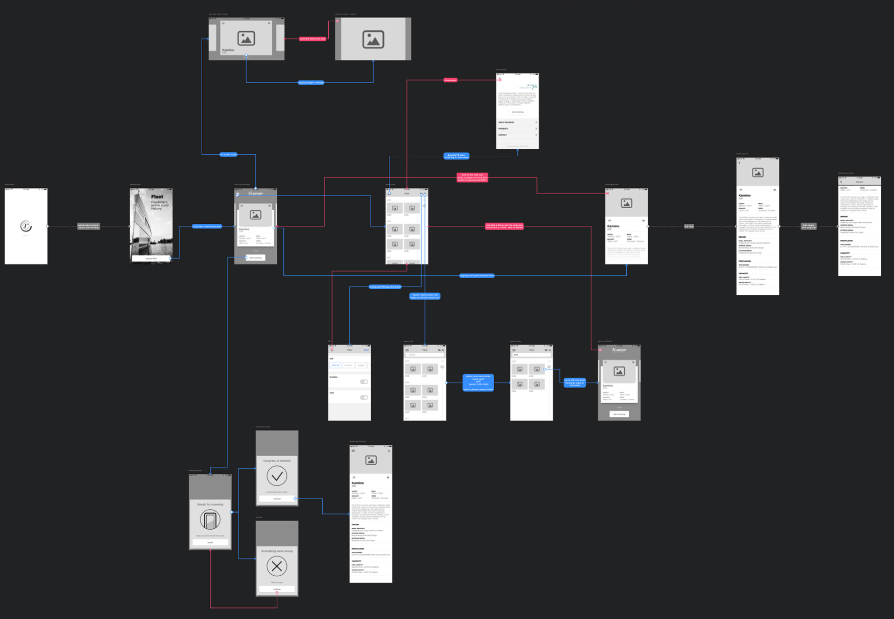
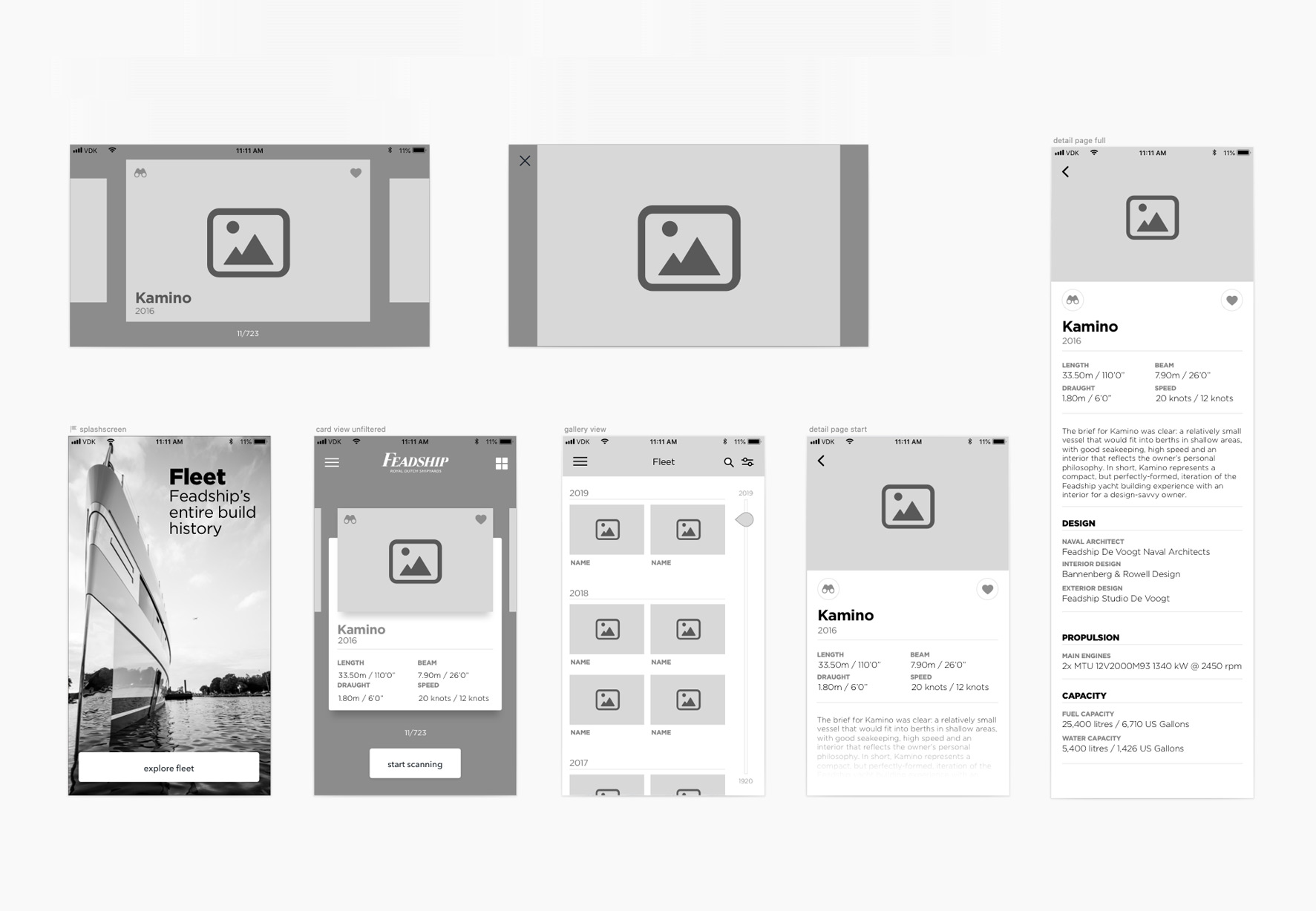
The first step is mapping out the digital playing field. Envisioning what pages and components we need and the flow throughout the multiple journeys. Below three phases of the flowchart that are shown in the slideshow. The amount of detail immediately indicates (to the client) the phase we were in.
sketch
Part of the debrief to a. the client and b. the agency, I first sketch out a flowchart. Pen and paper remains my weapon of choice when it comes to getting started and visualising what’s in my head. It also perfectly resembles what state of the project you’re in.
low fidelity
Secondly we clean up the sketchy mess, add iterations while digitalising the flow. We identify the primary user journey, and map out the routes, and enlist questions and ideas on the side.
high fidelity
The third flowchart is highly detailed, and takes shaping during the design phase. A powerful instrument when it comes to guiding the client in visualising the journey and getting a better understanding of the interactions.

UX Design
With the flowchart approved and the information architecture in place, I started designing the pages. The most challenging part was where and how the filtering took place; defining the difference between List View and Card View. To do so we first defined different use cases and types of browsers:
- Flick through Feadships and show basic information (card view)
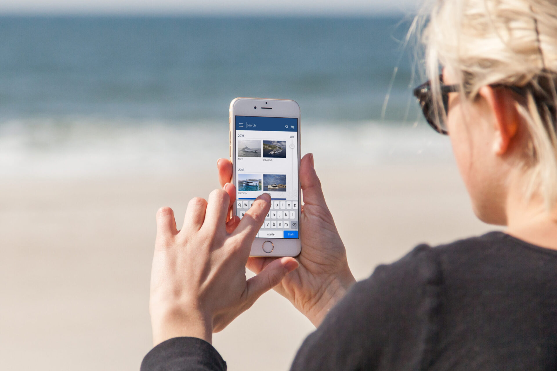
- An overview to quickly find a Feadship, based on year, length, favourite or spotted (list view)
- A fully immersive visual browsing experience, to emphasise these magnificent pieces of engineering (landscape mode)
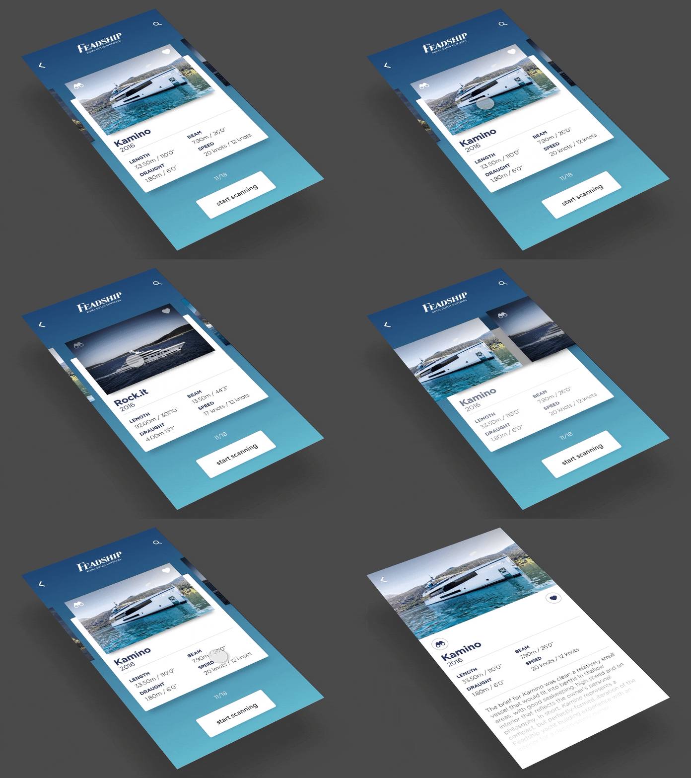
UI Design
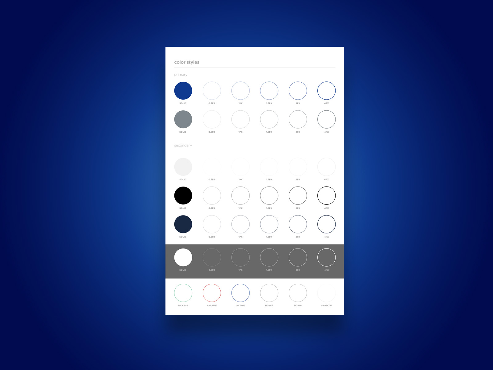
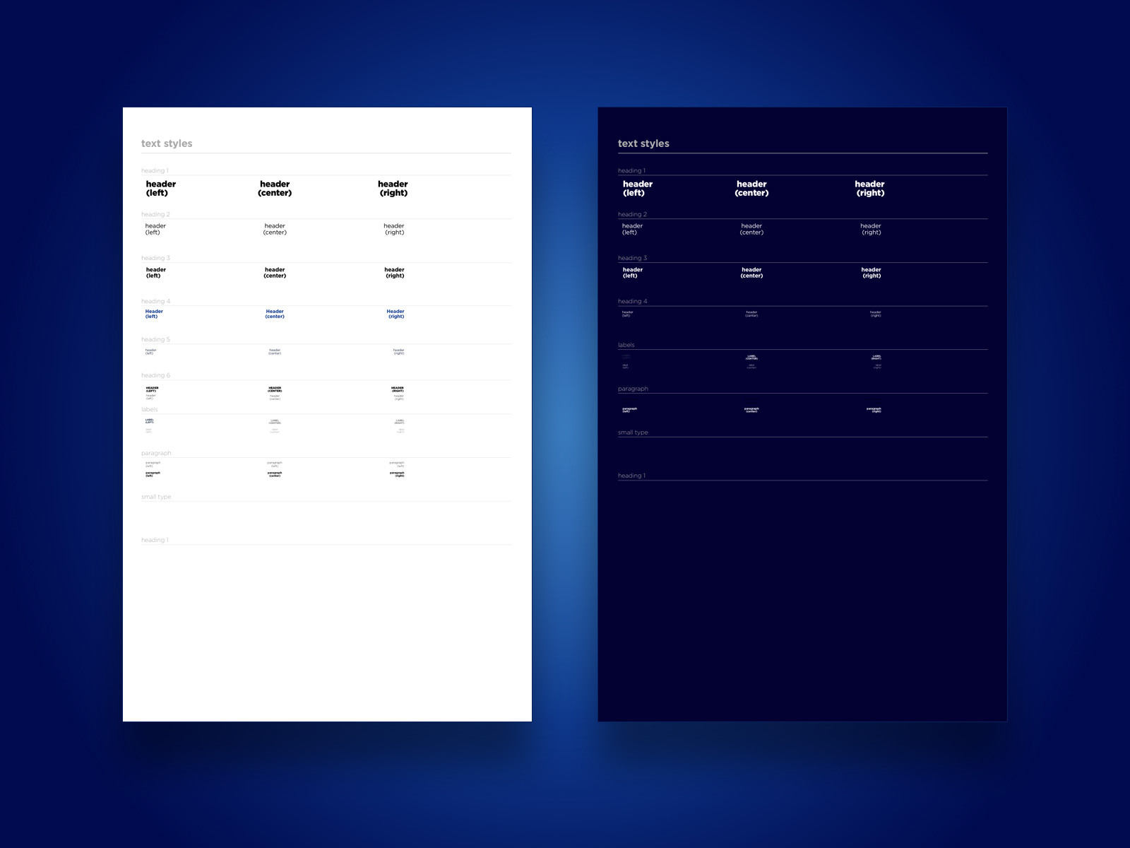
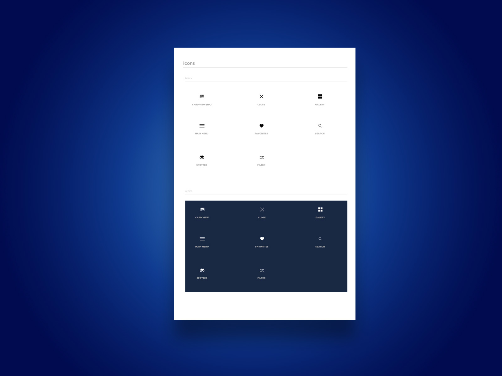
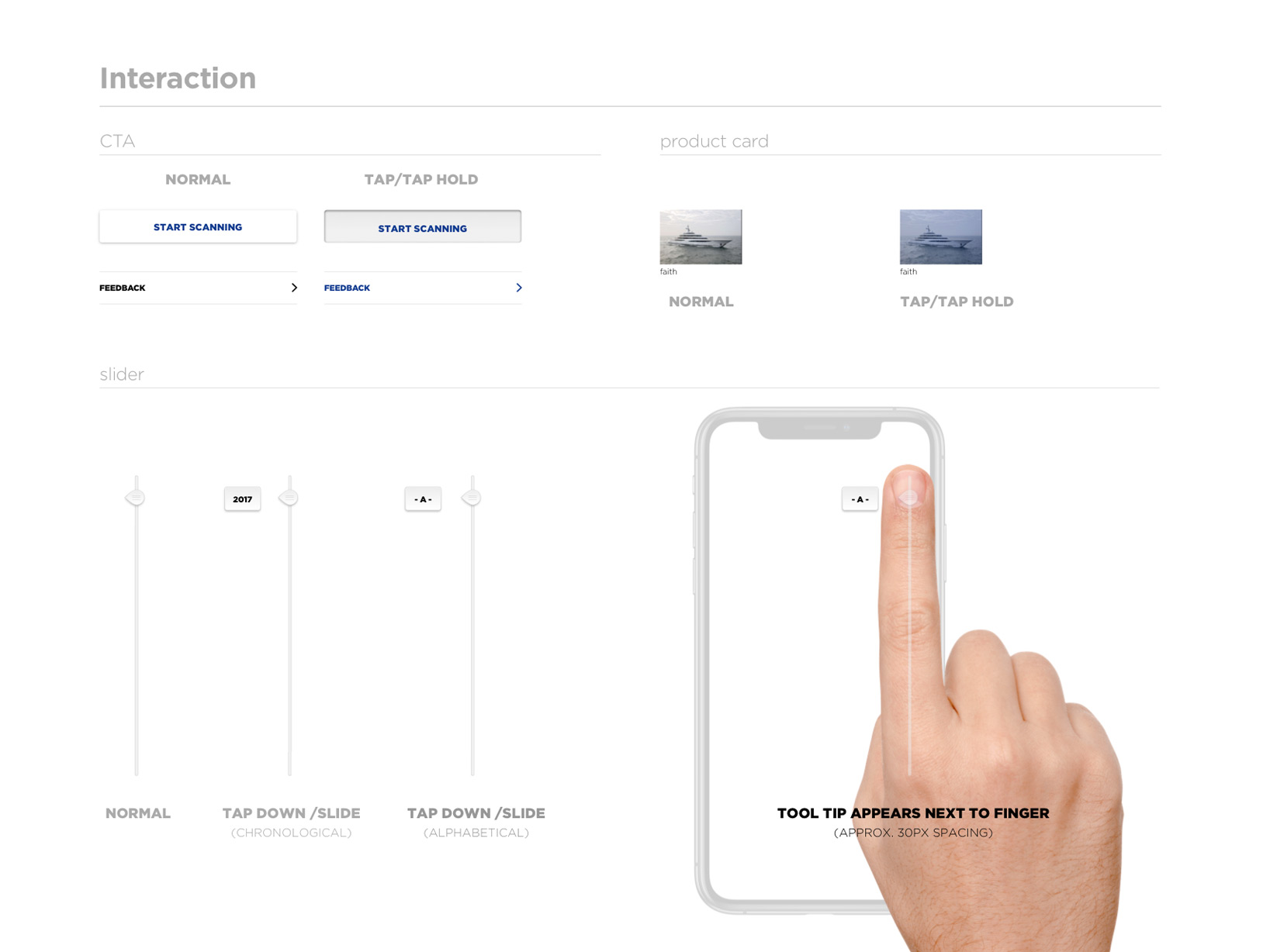
Because app design is often paired with multiple updates and iteration rounds, I decided to create a design library/foundation. Starting with colors, fonts and icons that are reused across the board. Later buttons, listing items etc. All are components, part of a massive UI library. Change once and the updated everywhere.
I created some motion examples to smoothen the handover to the devs.
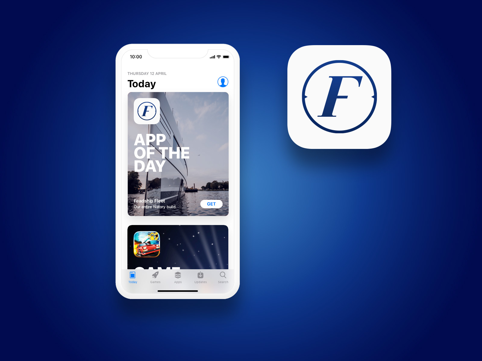
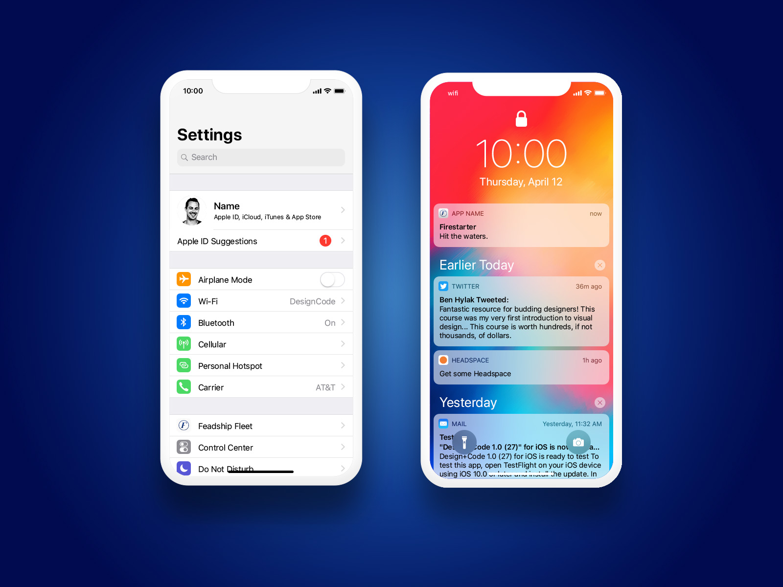
I ended up exporting all elements for iOS and Android. Three (iOS) to six (Android) different ppi resolutions. And the app icon, and (play/app)-store assets were the last piece of the puzzle.
This project was commissioned by Minibar
Role: UX/UI Lead
Minibar
Creative Director
Rogier Dekker
Sprigs
Lead Developer
Kreshnik Hasanaj
