Feadship
Art Direction, Concept, UX & UI Design
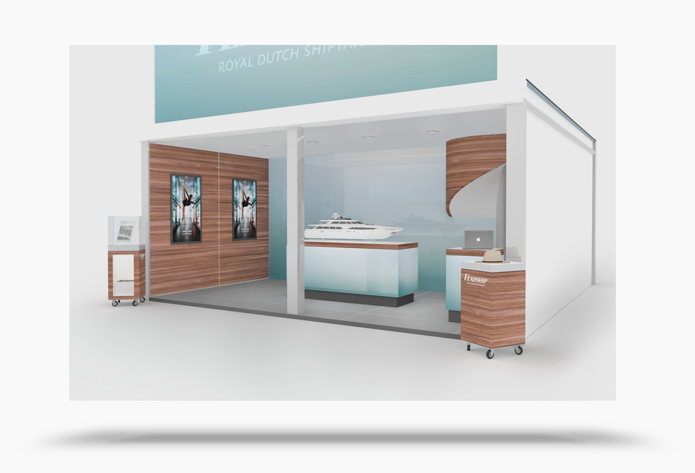
Creation of a custom build, interactive experience on the world’s biggest yacht shows.
Services
Objectives
Solutions
Results
Main Roles
Co Concept Creation
Sparring Partner of the Creative Director in shaping the concept. Consulting stakeholders on how the concept translates to UX.
UI Lead
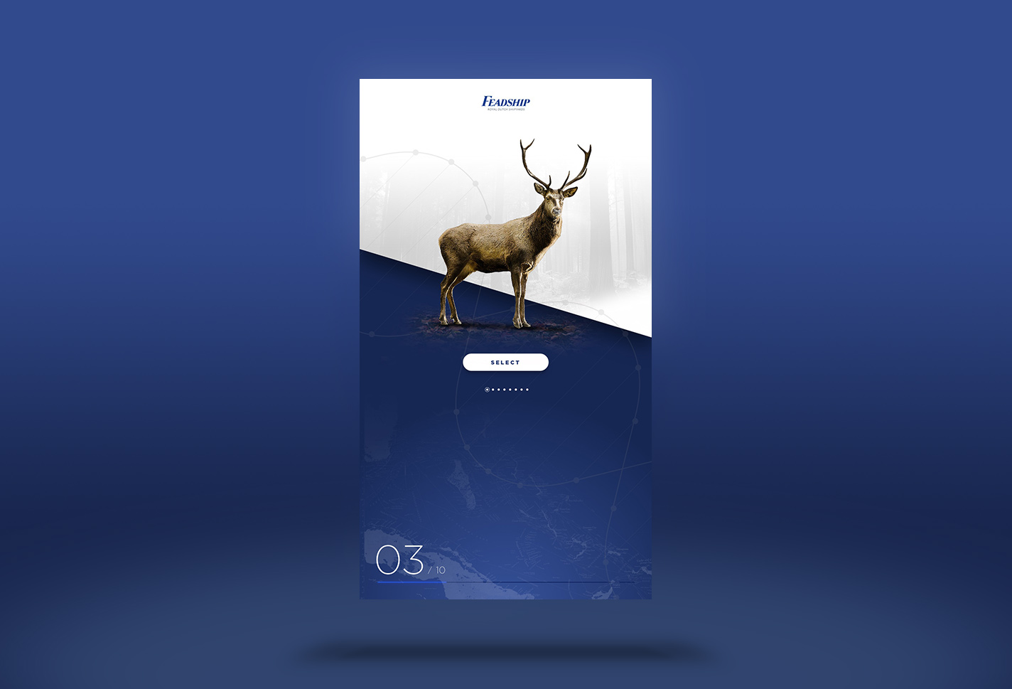
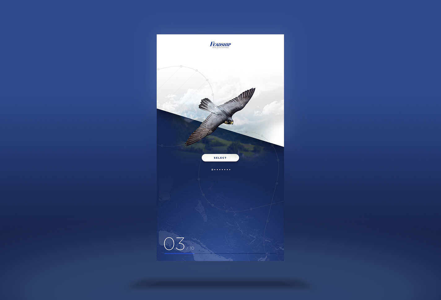
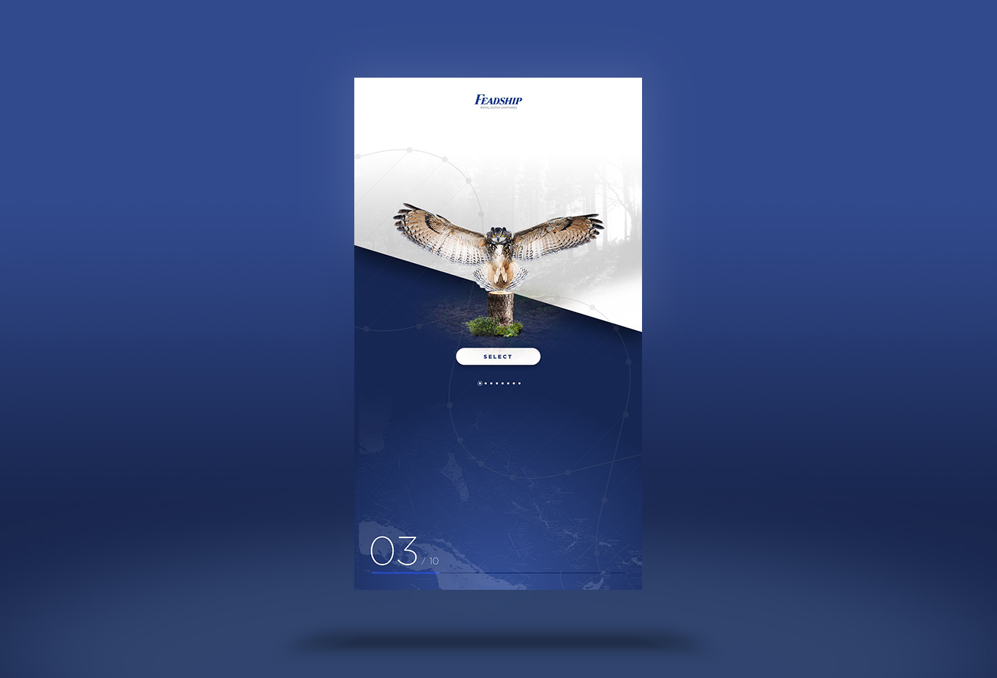
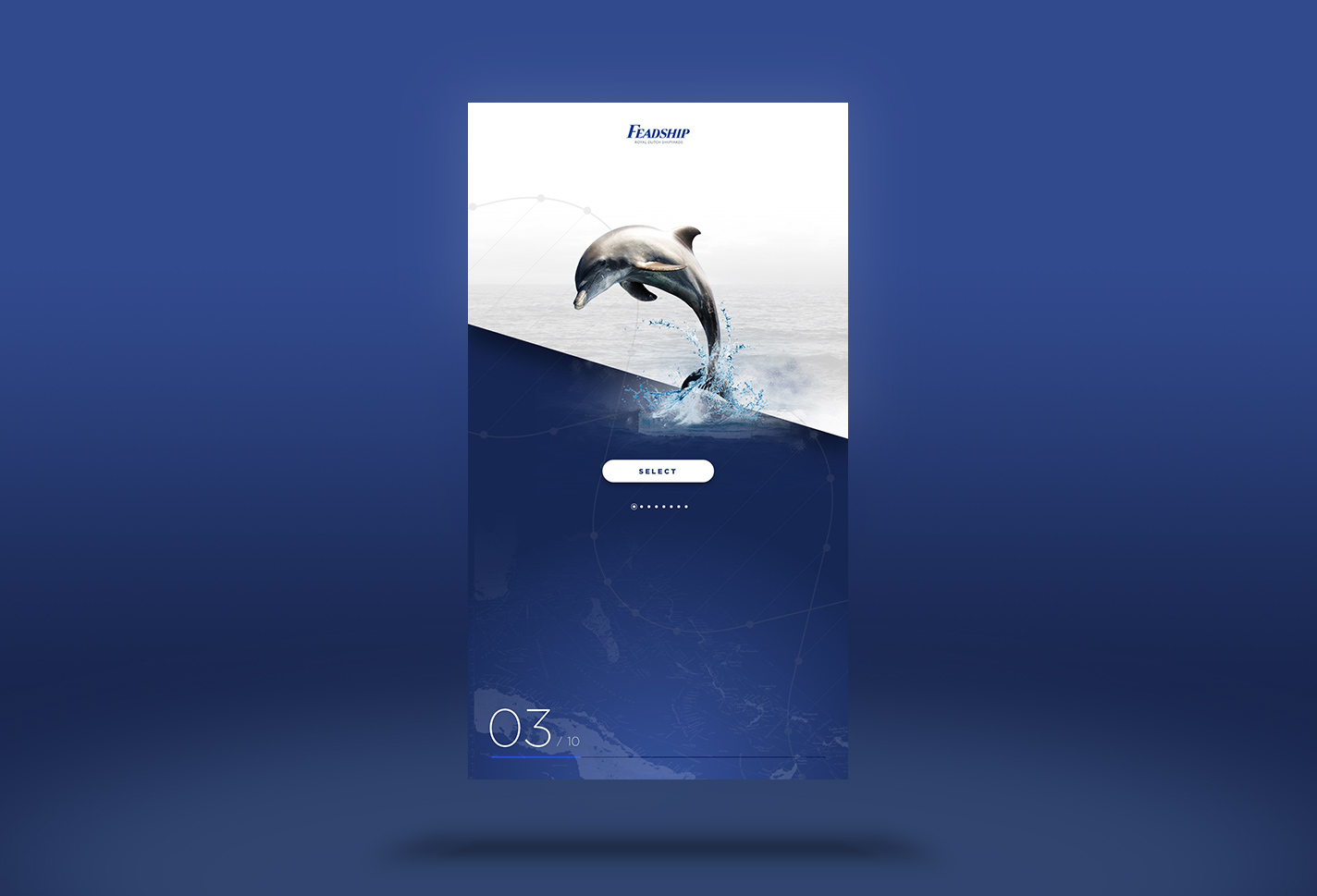
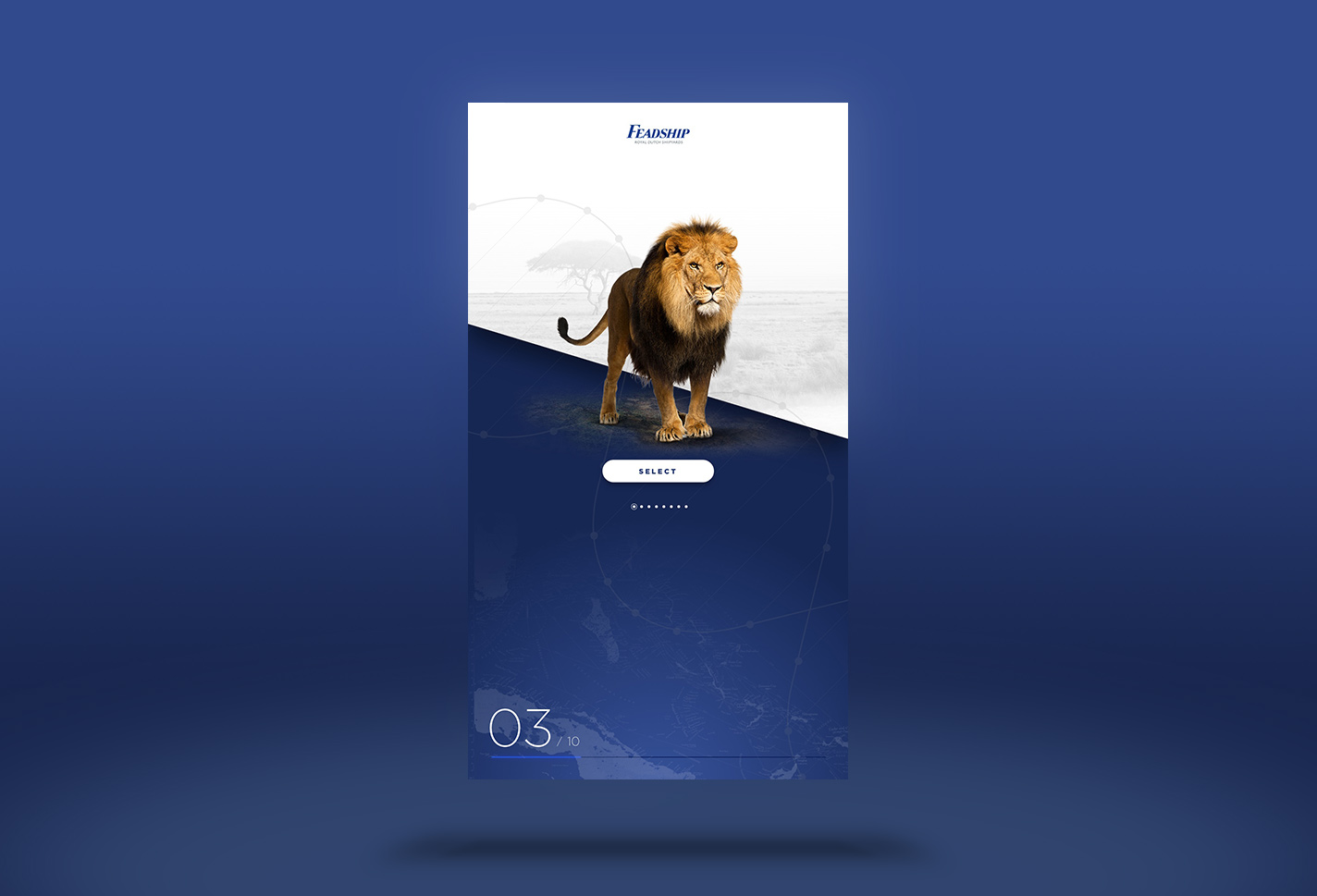
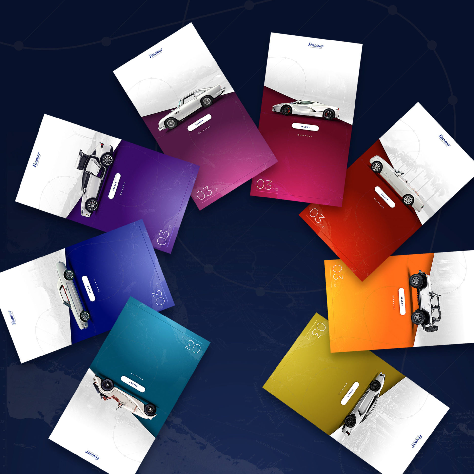
Making sure Feadships visual language is maintained. Pushing the envelope, where we combined motion, layout and color in patterns that maximise visual impact and optimise hierarchy, to keep the user focussed and entertained while being educated at all times.
UX Lead
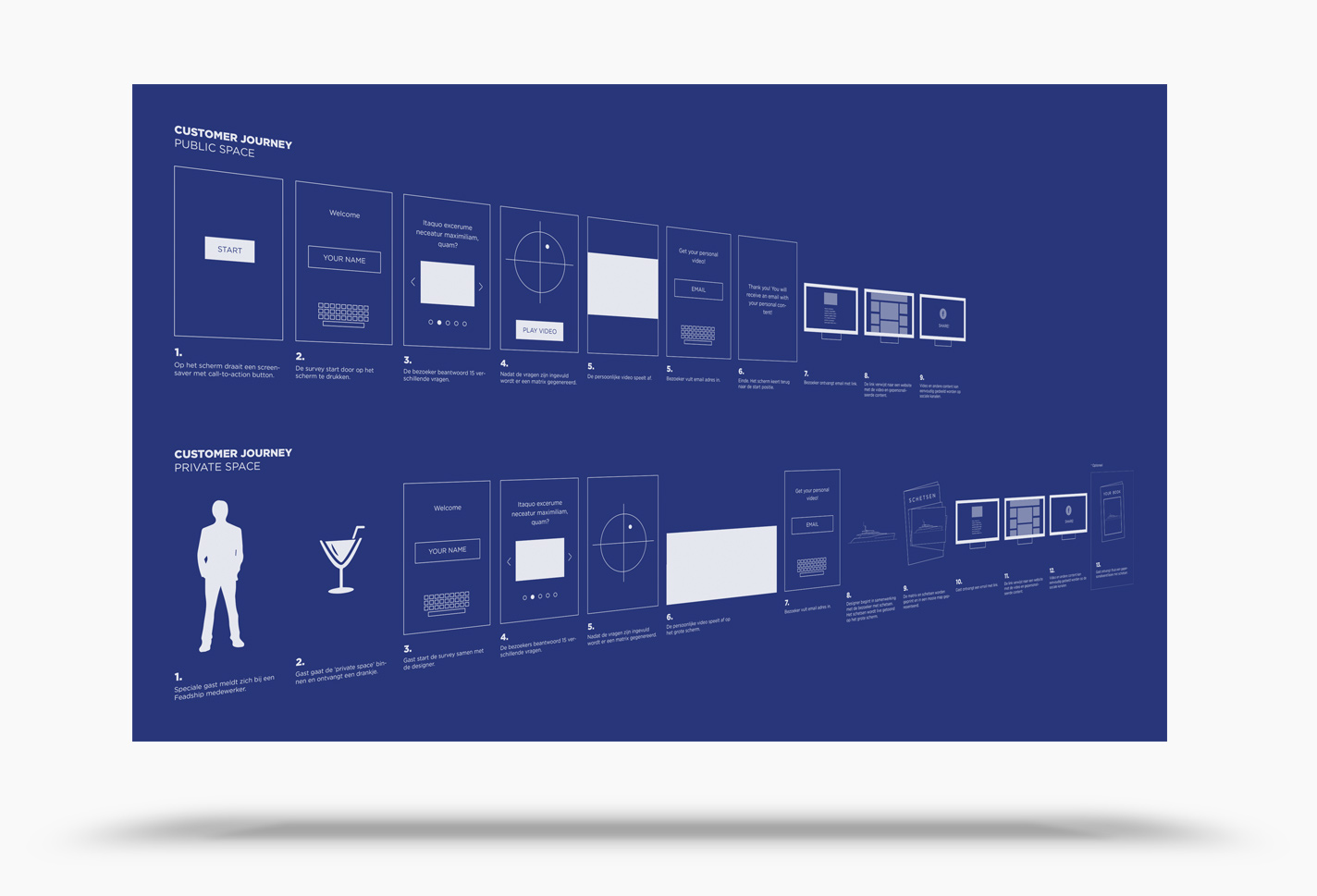
Managing client/stakeholders expectations. Collaborate across board, aligning the the multidisciplinary team, to ensure an optimal user experience.
Art Direction
Delivering high quality crisp images, that continuously spark the imagination of the user. Excite and surprise thru visual rhythm and color patterns combinations. Alignment with AV and 3d to create optimal, uniform, end to end journey.
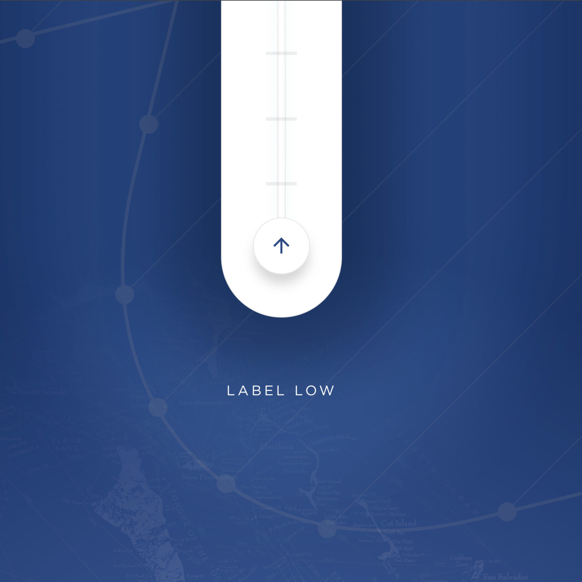
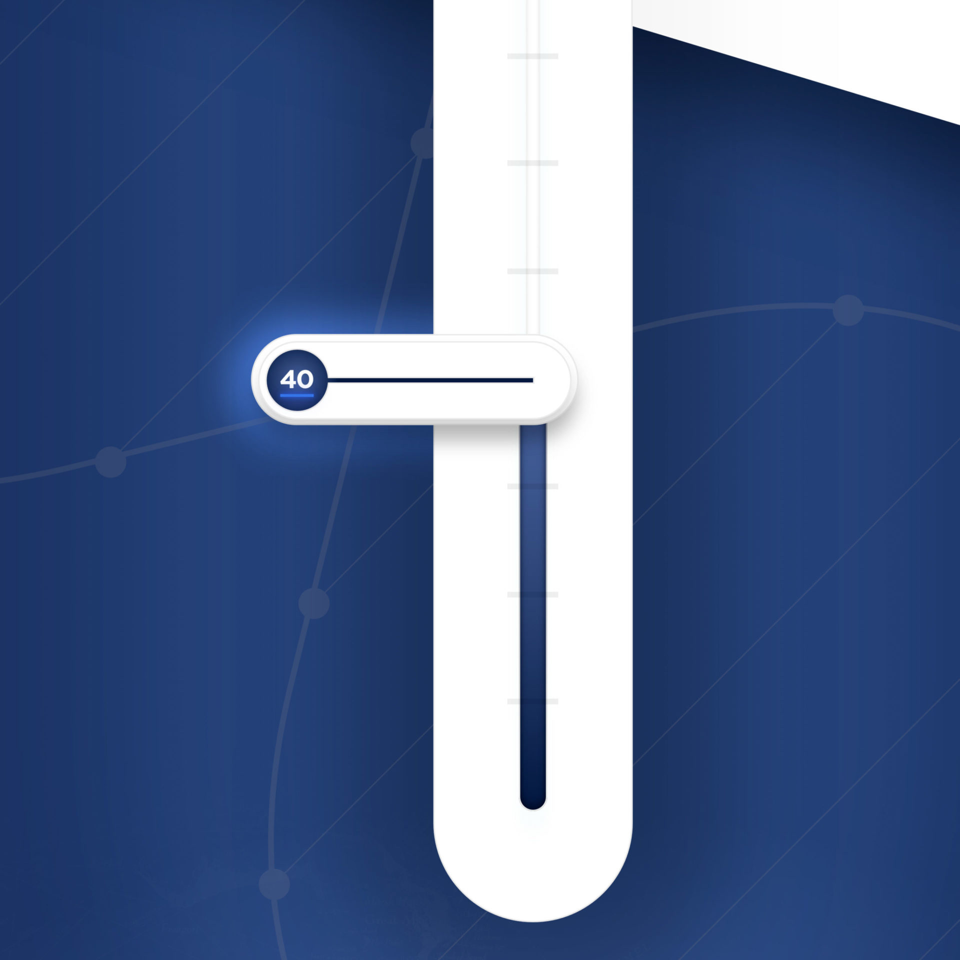
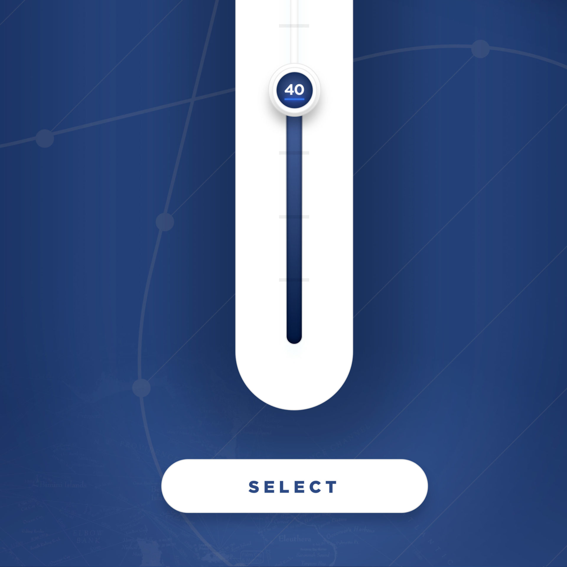
UX Design
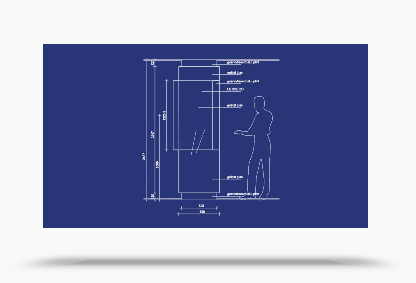
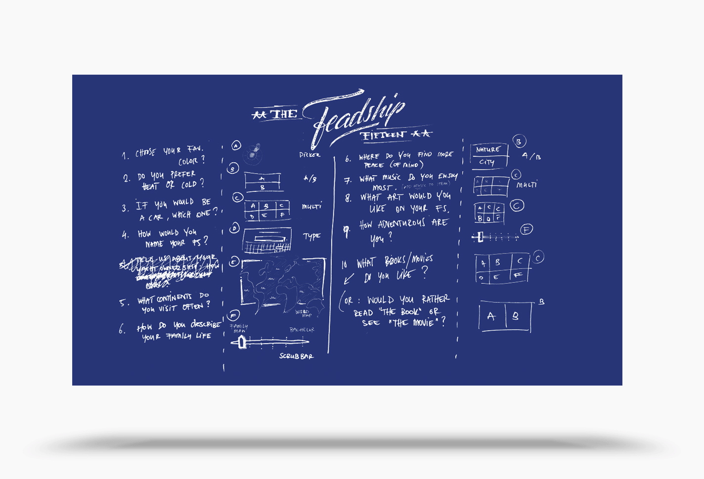
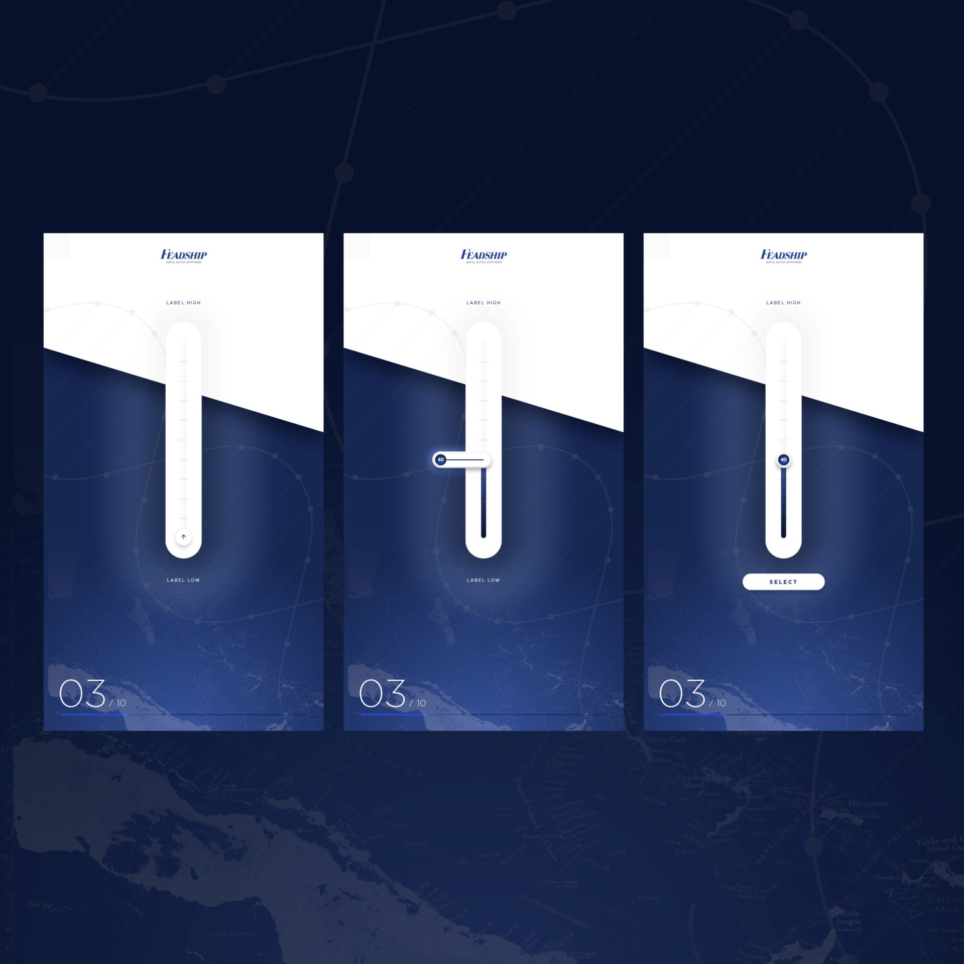
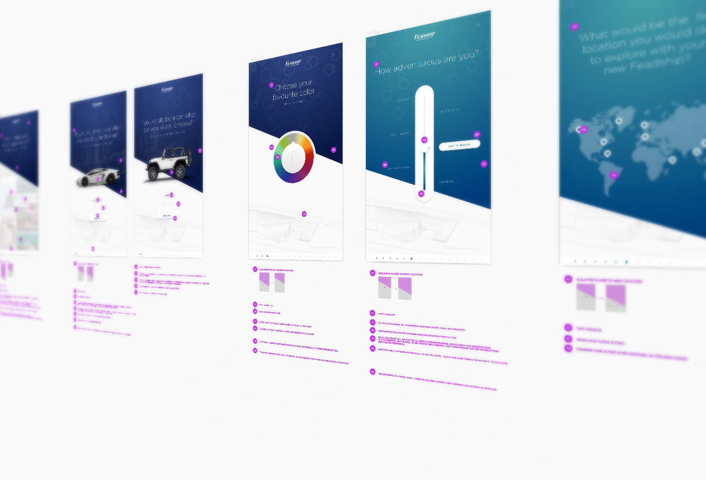
Most often i am asked to design for desktop mobile or tablet, where more available knowledge and previous research comes in place. For the Carte Blanche Experience the user is standing in a crowded area on a yacht show; people watching over their shoulders, where the interaction takes place on a 55″ screen. So what is the golden area of the screen real estate where it’s comfortable to ‘work’ and watch physically, but also thru the lens of privacy? How long is a user prepared to interact without losing interest? How can we optimise the flow of screens, interactions, and entertainment to reduce the sense of it taking too long. All question the team and I investigated during the UX phase of the project.

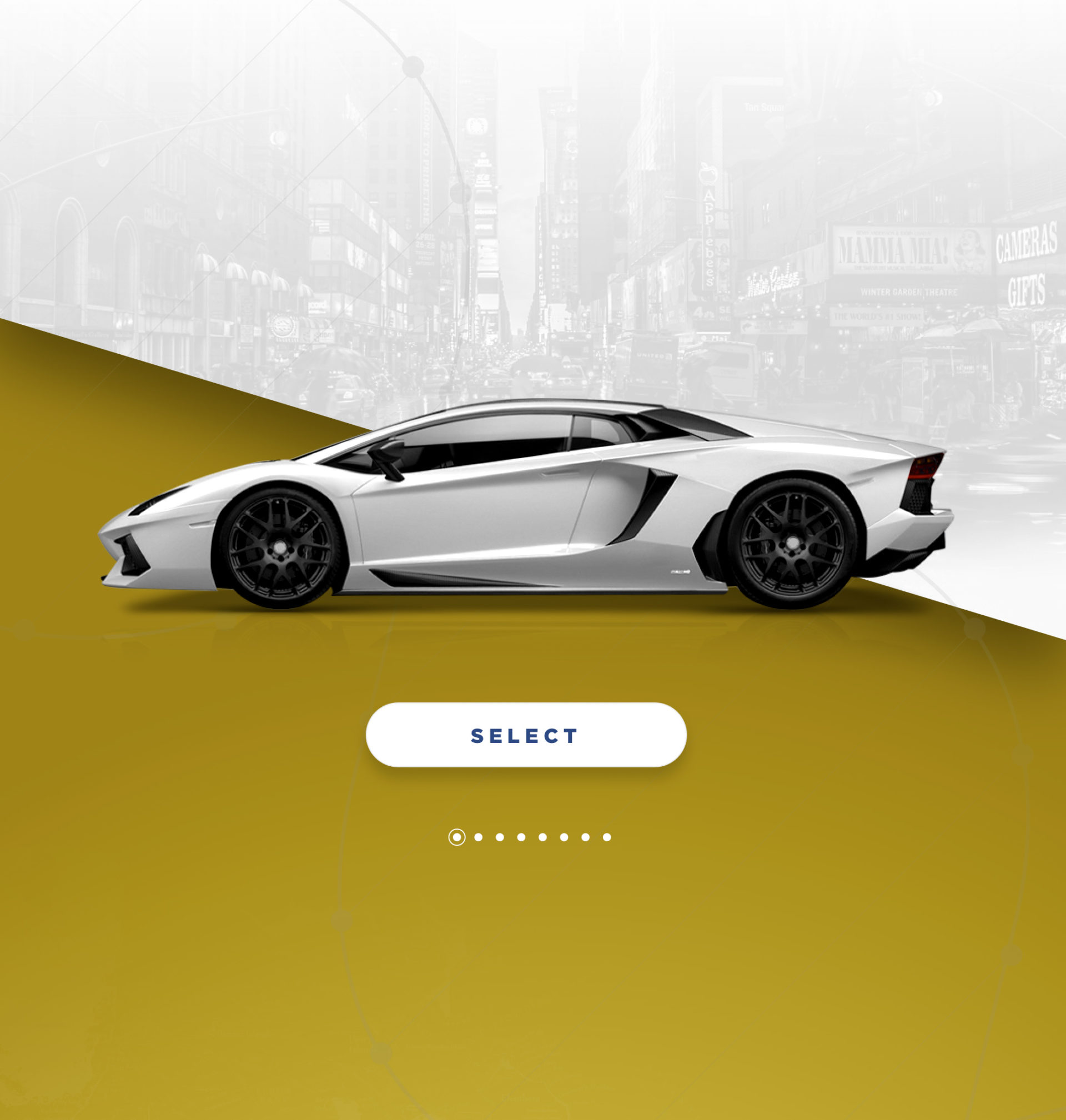

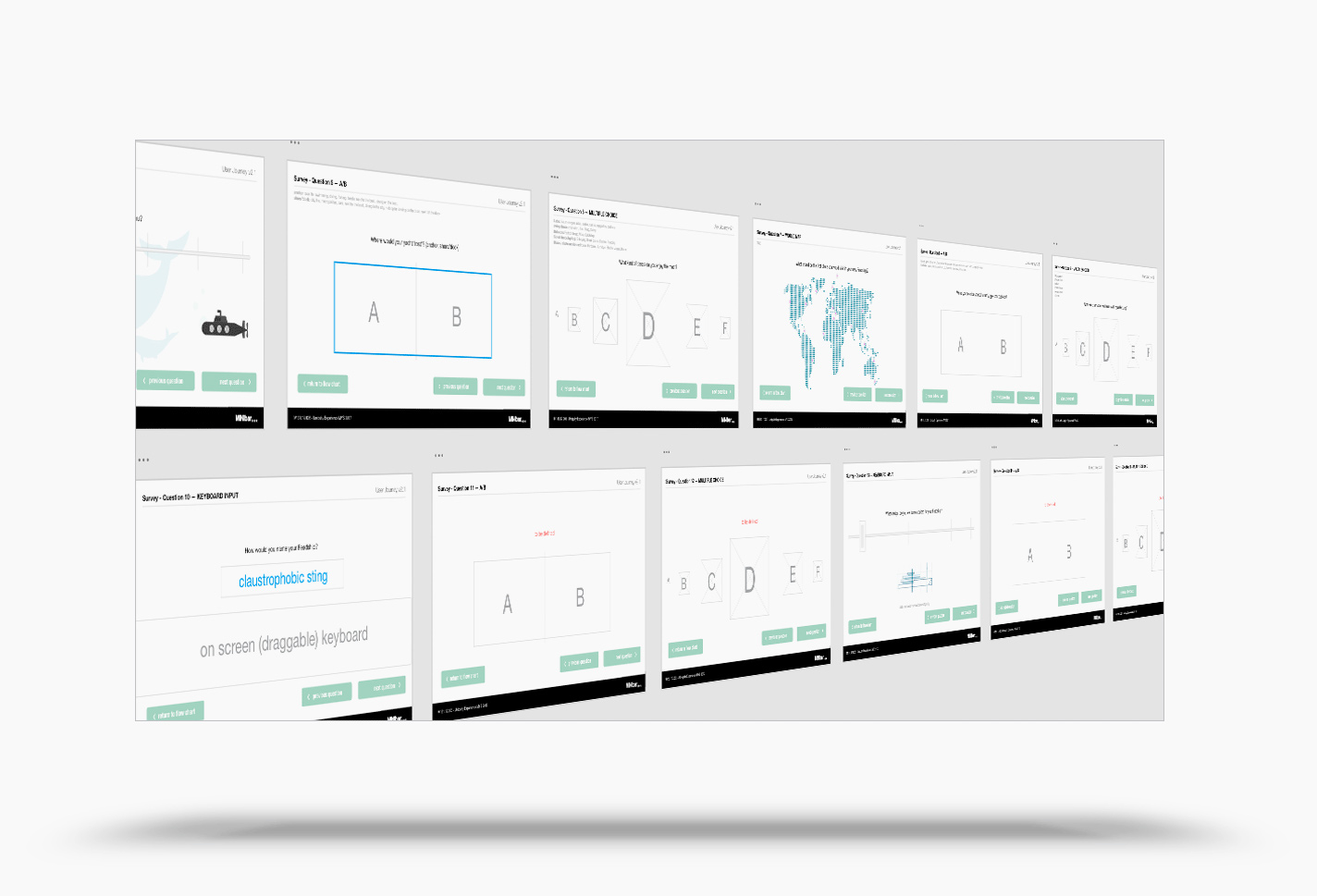
Prototyping & Testing
We had multiple iterations and testing rounds a small audiences in an early stage on ‘touch devices’. Validating if the interaction was logical and understood. And figuring out what took place inside the mind of the user. When the 55″ screens were ready we could optimise the most convenient screen real estate for users to ‘work’ in.

This project was commissioned by Minibar
Role: UX/UI Lead, Art Director, Co Concept
Producer/Creative
Rogier Dekker
Lead developer
Kreshnik Hasanaj
Sound design
Marcus Gehring
Editor
Vava Stojadinovic
